
Last week’s map series on the financial state of the European Union focused on a general overview of how population and economic activity relate to the financial framework of the Union. The current financial framework covers the period of 2007-2013 and ensures a certain planning security for the main areas of the common political goals of the EU. With the current framework expiring next year, tense negotiations are under way for the forthcoming Multiannual financial framework 2014-2020. The outcome will undoubtedly have major implications on the functioning of the European Union, as the budget allows key political areas to be pursued beyond national politics: “The Multiannual Financial Framework (MFF) defines the EU’s long-term spending priorities in line with the agreed political priorities and sets annual maximum amounts to be spent on each priority. The financial framework stretches over several years […] to ensure sound and responsible financial planning and management.”
The following map series shows the current funding priorities of the EU budget. It shows that beyond the net benefits and contributions, large proportions of the money are actually redistributed between the wealthiest member states. The first two maps compares how much is paid into and received from the EU budget by each member state at the moment:
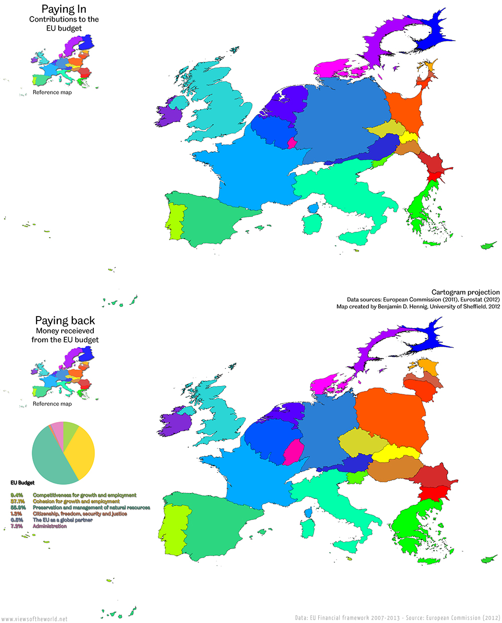
Although the poorer countries such as those in the east of the EU (following the colours of the wealth spectrum outlined before) indicate a certain element of solidarity in the redistribution, a lot of the money goes back to the largest contributors. This chart shows where the current EU spending focuses on:

These individual fields of spending are distributed very differently amongst the member states, as the following series of cartograms shows. The maps take each individual area of spending shown in this chart and resizes the countries proportionally according to the money they receive from this field of spending (explanations below each map are quoted from the Financial Framework documentation). The pie chart next to each map highlights the share of each of the fields of spending from the overall budget:
Competitiveness for Growth and Employment

(click for larger version)
This includes “research and innovation, education and training, trans-European networks, social policy, economic integration and accompanying policies.“
Cohesion for Growth and Employment

(click for larger version)
This includes the “convergence of the least developed EU countries and regions, EU strategy for sustainable development outside the least prosperous regions, inter-regional cooperation. […] Cohesion policy helps poorer regions and countries catch up and connect to the Single Market..”
Preservation and Management of Natural Resources

(click for larger version)
The largest part of the EU budget “includes the common agricultural policy, common fisheries policy, rural development and environmental measures.“
Citizenship, freedom, security and justice

(click for larger version)
This includes “justice and home affairs, border protection, immigration and asylum policy” as well as “public health, consumer protection, culture, youth, information and dialogue with citizens.“
EU as a global player
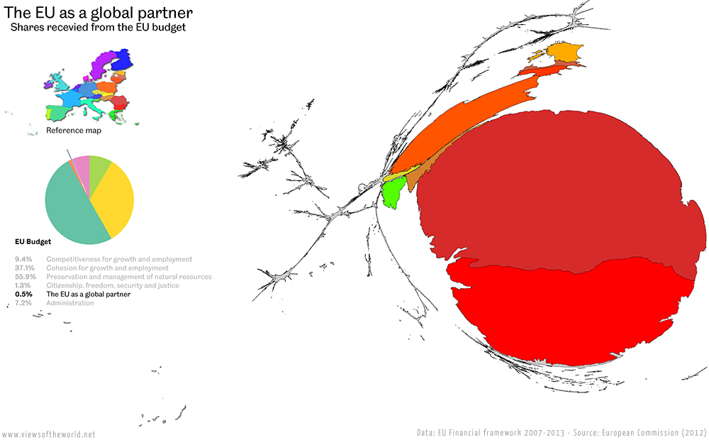
(click for larger version)
This area “covers all external action (“foreign policy”) by the EU.“
Administration

(click for larger version)
This much discussed aboutfield of spending “covers the administrative expenditure of all the European institutions, pensions and EU-run schools for staff members’ children (“European Schools”).”
This map series explains the patterns behind the EU budget which are less discussed in the public. They show which member state benefits from what area of spending, where national interests were most secured, but also how common EU policies try to address regional imbalances to achieve more social cohesion and sustainability in Europe. The maps give a clearer picture of EU spending that merely looking at the total ‘costs‘ as well as the net spending (and net benefits), and the often discussed costs of bureaucracy.
The European Commission’s own account of the budget is of course biased, but makes a point about the benefits from a joint budget that funds common policies that individual member states would hardly engage in: “The EU budget focuses on bringing growth and jobs, tackling climate change, migration, cross-border crime and other challenges that affect us all. It helps boost prosperity, for example by better interconnecting Europeans through energy, transport and ICT infrastructure, by supporting less well-off regions to create growth and jobs both there and in the rest of the EU, and by pooling our efforts in areas like research. It is also about securing our own food supply. And finally, it is about making the EU’s size count in the world – just as the US and China make their size count, and pooling our efforts to help the world’s poorest people.”
While one may understand the criticism of spending money on the European Union in times of austerity and recession, a lot of the debate misses the central question of what the European Union means as a project for Europe. Some of the arguments brought forward are also distorted or incomplete, resulting in some EU budget myths circulating the public opinion in the countries most skeptic of the EU. To counterbalance this, here are some more facts behind these maps (as outlined by the European Commission): “The EU budget was around € 140 billion in 2011. […] To put this in perspective, the average EU citizen paid […] 67 cents on average per day to finance the annual budget in 2010. […] the EU budget represents around 1% of EU-27 Gross Domestic Product – the total value of all goods and services produced in the EU […] 94% of what is paid into the EU budget is spent in Member States on policies and programmes that benefit citizens directly.”
This is what the above maps show: The money is being redistributed, and in large it benefits the individual member states – sometimes very directly within their own country, but beyond that also by creating a more equal Union, which should remain its main goal in the future. For doing that, the most capable countries should perhaps give in on some of the benefits they receive from the EU and therefore allow the EU budget to focus more on a larger solidarity between the member states for a better future…
The following interactive graphic by the European Commission allows you to explore the data shown in the maps interactively to find out more details and changes over the years:
Note: The figures used in the maps are the most recent as published by the European Commission. According to the EC, the data includes the 2011 adjustments for national GDP movements. If a country’s GDP is significantly above or below the estimate, the amount allocated for cohesion policies (to increase economic convergence between EU members) is adjusted accordingly.
The content on this page has been created by Benjamin Hennig. Please contact me for further details on the terms of use.