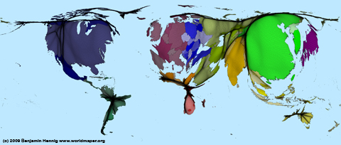
Building upon the maps in the previous post we also created a gridded cartogram showing the national per capita emissions joined with the earlier introduced population grids. The resulting map gives an indication of the areas where most carbon emissions are produced beyond country boundaries:

The content on this page has been created by Benjamin Hennig. Please contact me for further details on the terms of use.
