
High hopes of England have vanished on today’s draw of the forthcoming FIFA Football World Cup hosts, with Russia getting the event for 2018. More surprise was caused by Qatar which will be hosting the 2022 World Cup: With an area of 11,437 sq km and a population of approximately 1.7 million people, by far the smallest World Cup host in Fifa’s history.
In fact, Qatar is so small that we didn’t even bother to put up an individual map for Quatar in the Worldmapper World Population Atlas, but merged it with Saudi Arabia and Bahrain (Russia has its own map though, despite beating England’s bid).
With its new fame, Quatar’s population shall now get its own population cartogram which gives space to all the people living there and removes all those sandy areas in the south and west. Here is the Qatar gridded population cartogram:
Tag Archives: population

Population Cartogram of Myanmar/Burma
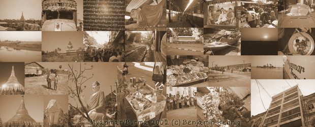
Burma, or officially Myanmar, gains the world’s attention mainly with some sort of bad news in recent years: The suppression of the Saffron Revolution in 2007 and the natural disaster of Cyclone Nargis in 2008 are the most prominent events that brought the country back in people’s minds. Apart from that, few of us now much more about the country, which is ruled by a military regime since 1962.
Now it is back on the news agenda, as the first elections since 1990 have been announced to take place today. The 1990 result has been ignored by the ruling junta and Aung San Suu Kyi the leader of the then-winning party NLD has been under house arrest most of the time since 1989. Many wonder what impact this year’s election will have – if any at all. Apart from all the political implications, the perhaps most significant implication of this election – regardless of the outcome – is the fact that “We must keep telling Burma’s story“. Few genuine stories cross the borders, and there are little insights to the life under military oppression available, such as the footage of Burma Soldier which has recently been shown at Sheffield Doc/Fest.
Telling Burmas story does include learning about the country’s geography. As this website is all about maps and visualisation, this can be shown with a map to visualise the basic geography of Burma (drawing a map of the election may be less useful given the doubtful nature of these election and the general lack of reliable data). The following map shows a conventional physical map of Burma (with selected cities labelled) compared to a gridded population cartogram that visualises the population distribution. The population map shows the importance of the Irrawaddy delta region which is the most densely populated area of Burma. This explains the impact that cyclone Nargis had in this area that is situated only few metres above sea level. Yangon (or Rangoon) with a population of approximately 5 million lies on the Eastern edge of the delta region. It had also been Burma’s capital until 2006, when the military government decided to move the capital away from the main population to a less populated region but strategically well situated between Yangon and Mandalay. As a result, Naypyidaw was announced the new capital in March 2006. The last royal capital Mandalay, Burma’s second largest city, is the centre of the economically important region of upper Burma which is heavily influenced by trading links to China’s Yunnan province. Much less populated are the mountainous regions in the North of the country. Here are the maps:

Mapping the US midterm elections
Two years after Obama has been elected president, another political change has come to the United States in this year’s midterm elections. Politically most significant will be the changed balance of power in the House of Representatives, which has now a majority for the Republican party (winning 240 of the seats, compared to 186 going to the Democrats, and 9 undeclared at the time of writing). Unlike the seats in the US Senate (with still a small majority for the Democrats), the share of seats in the Congress reflects roughly a quite equal population. The congressional districts, which are the decisive constituencies for the House of Representatives, are thus reflecting a general image of the political mood in the US (while the Senate is composed of two Senators for each State, regardless of the population).
Therefore it makes sense to create a different map of the election results for the House of Representatives in order to show a population-centric view of this year’s midterm. The following map uses a gridded population projection and maps the election results onto it, so that it shows the proportional population share of the results in its true dimension: Each person on the following map has the same space, so it reflects the number of people represented by each member of congress. To see where changes took place, different shadings of red/blue have been used in addition. The map uses the same colour key as the election maps on the Guardian website – their map allows you to identify any of the States and gives further details on the results for each electoral district.
This is how the results from the election to the House of Representatives in the 2010 Midterm elections of the United States look like on a population projection (a geographical view with a conventional map is included as an inset to allow comparison with the more commonly used maps):

What I heard about the world
 This iconic composite image of the earth at night of NASA’s Defense Meteorological Satellites Program is the world as we imagine it when the earth is not facing the sun. But this image does not tell the full story of the night’s world, as it suggests that it shows where people are (because there is light). There are actually many people living with little light at night (and perhaps many others wish for some less light, but live in one of the bright spots of this image). Therefore, this image is some kind of fake thing when it comes to the real world at night. The real world at night for the world’s population looks more like the following map, which has been shown on this website before (see here). The reason for showing it again is not only that it has become the header-image of this website, but because the theatre performance What I heard about the World recently incorporated this map in the show’s announcements:
") (click for large image)
(click for large image)
See here for an updated and more detailed version of this map
Serpentine Gallery Map Marathon
This map is part of this weekend’s Map Marathon at the Royal Geographical Society in London. It is an event of Serpentine Gallery and was conceived by curator Hans Ulrich Obrist (here an interview with him talking about the event) . This is a quote from the official announcement:
The Serpentine Gallery Map Marathon will bring together an unprecedented group from diverse fields to showcase possible maps for the coming decade. The Map Marathon will explore all forms of mapping, of data, space and time, multiple dimensions, language and the body. The event will uncover the influence and possibilities of mapping in our world today.
A similar version of this map has already been shown in some of my presentations (and those of the Sasi Research Group), and it is also a contribution for the forthcoming “Maps for the 21st Century” book to be published in 2011:

And this is part of the caption that goes along with the map: The new world map creates an unprecedented view on the world’s population which allows new perspectives for mapping the social dimension of our planet. The projection creates space in areas that matter most in a human world. Mapping the physical terrain onto this map reveals at which elevation most people live on earth. Most people living at high elevations live in East and South Africa, whereas in East Asia the densely populated coastal plains become apparent.
Continue reading
The Population of Germany
Today Germany is celebrating the 20th anniversary of unification of the until 1990 split East (German Democratic Republic) and West (Federal Republic of Germany). But while the areas have merged, in many people’s minds the division remains – recently prominently demonstrated in an interview by German chancellor Angela Merkel.
The dominance of the West is not least reflected by the population distribution between the two countries, with only Berlin being the most significantly populated area of the generally quite sparsely populated East of the country. Few other urban areas strike out when looking at the population distribution, which is displayed on the following gridded population cartogram. As the map in an equal-population depiction, each area of the map corresponds to the same number of people, so that the underlying geographical grid is distorted accordingly (reducing the size of less populated areas while increasing the size of the most populated areas). The colour code shows the population density in each of the grid cells (click the map to see further details in higher resolution):
