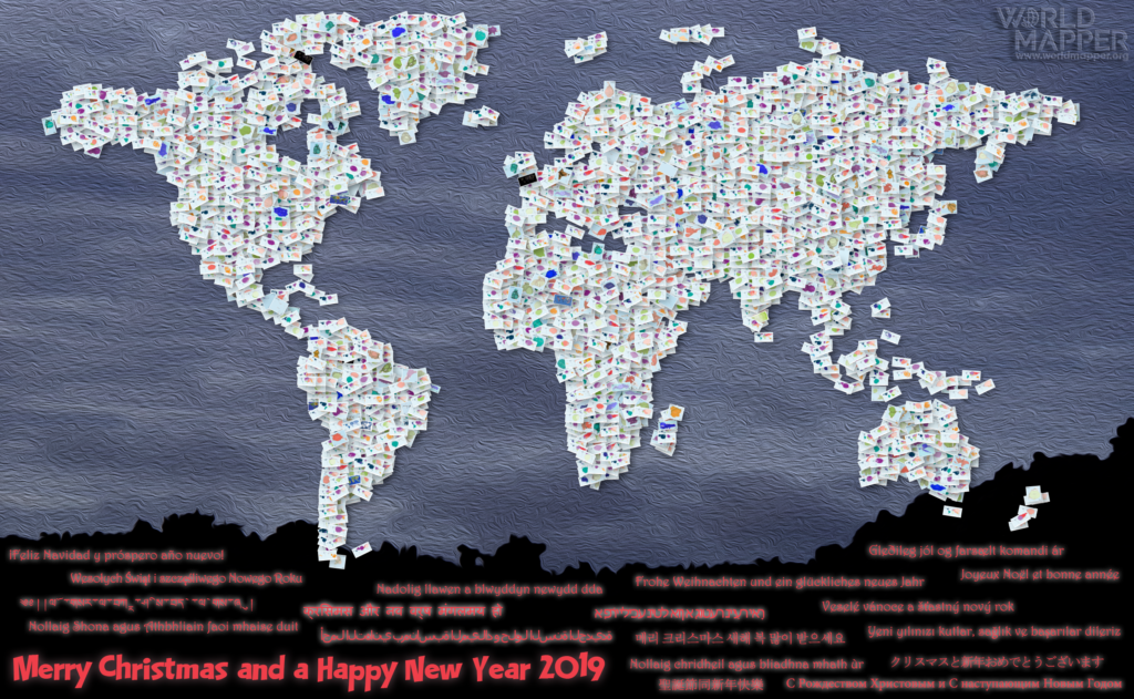
2018 has seen the new Worldmapper come to light, which is also why this blog has become a bit more quiet in recent months. This year’s Christmas greetings show a collage of the 569 new maps that we have published on Worldmapper since its launch in April:
 Continue reading
Tag Archives: worldmapper
World Cup Cartograms
The 2018 FIFA World Cup in Russia has not been without controversy from the very beginning, starting with corruption allegations during the selection procedure to the most recent political incidents. And yet, the ball is rolling and the sporty side of the event is now getting more attention. From a data perspective, football world cups have become a gold mine that also helps to put a spotlight on the geographical landscapes of one of the most popular sports around the world. The world cup has become a game of dominance of European and South American dominance, while part of the appeal of the game is the unexpected success of ‘underdogs’ that beat the big players. The following maps are taken from a new series of football cartograms made for the Worldmapper website that visualises over eight decades of the event’s history. This is the shape of the football world:
Worldmapper: The Relaunch
Featured
There is a new map in town! Earlier this month during the 125th Anniversary Conference of the Geographical Association in Sheffield (UK) we relaunched the new Worldmapper.org online platform which has been several years in the making. It is not only a fully redesigned website, but also redefines what we want Worldmapper to become over a decade after it has first been released: An atlas for the 21st century that is mapping our place in the world using cartograms.
At the very heart of it Worldmapper is still a collection of world maps where countries are resized according to a broad range of global issues. But with the new website we will increasingly use more diverse cartogram techniques, such as gridded cartograms, as well as start including maps at different scales such as country-level mappings seen on this blog in many ways. Worldmapper will therefore be the most comprehensive repository for cartogram-style mappings that are unique visualisations showing the world as you’ve never seen it before. Check it out at: Worldmapper.org Continue reading
Olympic Winter Games PyeongChang 2018
The 2018 Winter Olympic Games in PyeongChang have come to an end. Branded as the ‘Games of new horizons’, they were as much about politics as they were about actual sports. The following cartogram series focuses on the sports side of the games, showing the distribution of medals that were awarded during the games. The maps show each country resized according to the number of medals received by each country (with the Olympic Athlete from Russia shown as Russia):
The World in 2018
Featured
7.6 billion people producing an estimated global GDP of 131 trillion dollars (measured in purchasing power parity), that is the world in 2018. In its latest forecast, the International Monetary Fund predicts predicts a continuing global economic growth of 3.9%, while according to the United Nations Population Division an extra 83 million people will populate this planet (1.9% growth). The following two cartograms show, how the distribution of wealth and people looks this year by resizing each country according to the total number of people (top)/GDP output (bottom):
Species at Risk
Trying to get a picture of where and how many species globally are endangered or even at risk of extinction is a difficult undertaking. For 50 years the International Union for Conservation of Nature (IUCN) publishes the red list of threatened species. The list is a “comprehensive information source on the global conservation status of animal, fungi and plant species and their links to livelihoods”. It contains over 77,000 species of which according to the most recent report more than 22,000 are at risk of extinction. IUCN considers species at risk when they are “critically endangered, endangered or vulnerable.”
Mapped here is data from the International Union for Conservation of Nature’s (IUCN) Red List of threatened species including endangered and vulnerable species. The main cartogram shows countries resized according to all animal and plant species assessed as being at risk of local extinction. The two smaller cartograms highlight that conservation efforts have very different spatial degrees of severity, which also partly reflects the different geographical distribution of species.


