This cartogram shows the distribution of votes for the two main candidates in the 2020 US Presidential election. Shown in diverging colours is each respective candidate who received the largest share of votes in each county. The cartogram itself shows an equal-population projection (gridded population cartogram) where each grid cell in the map is resized according to the total number of people living there. The main cartogram is accompanied by a ‘conventional’ reference map that also shows the states of Alaska and Hawaii (using state-level results for these two states):
Tag Archives: cartograms
Re-Enlightening Views of the World
Featured
A time where ‘real world’ conferences are a memory of the past is a good opportunity to look at the wealth of material that has been put online instead. Here is one of my talks that has recently been put online. It’s a four-minute ‘Lightning talk’ given at last year’s Anniversary Annual Conference of the Global Young Academy. Lightning Talks are giving a brief overview of a topic aimed at a broader audience, and here I am – obviously – talking about mapping and cartograms: Continue reading
Trading with the Commonwealth: A future perspective for the UK?
 Commentators have suggested that the Commonwealth could become more important for UK trade after Brexit. This article for Political Insight (June 2018, Volume 9, Issue 2) maps the current state of British-Commonwealth trade and finds a more mixed picture of UK-Commonwealth trade relations. Continue reading
A Year Of Maps
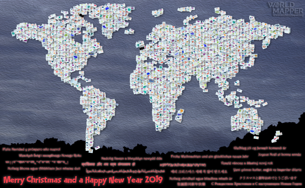
2018 has seen the new Worldmapper come to light, which is also why this blog has become a bit more quiet in recent months. This year’s Christmas greetings show a collage of the 569 new maps that we have published on Worldmapper since its launch in April:
 Continue reading
Language Diversity
There are approximately 7,000 languages believed to be spoken around the world. Despite this diversity, the majority of the world’s population speaks only a fraction of these languages. The three largest language groups (Mandarin, Spanish, and English) are spoken by more than 1.5 billion people. Other estimates state that 2/3 of the world’s population share only 12 languages.
But it is the diversity of the languages spoken by the few that makes language a remarkable cultural phenomenon. It is estimated that about 96 per cent of the languages are spoken by only 3 to 4 per cent of the people. 2,000 of the world’s languages have less than 1,000 native speakers.
World Cup Cartograms
The 2018 FIFA World Cup in Russia has not been without controversy from the very beginning, starting with corruption allegations during the selection procedure to the most recent political incidents. And yet, the ball is rolling and the sporty side of the event is now getting more attention. From a data perspective, football world cups have become a gold mine that also helps to put a spotlight on the geographical landscapes of one of the most popular sports around the world. The world cup has become a game of dominance of European and South American dominance, while part of the appeal of the game is the unexpected success of ‘underdogs’ that beat the big players. The following maps are taken from a new series of football cartograms made for the Worldmapper website that visualises over eight decades of the event’s history. This is the shape of the football world:


