The Arctic Circle Assembly is the largest annual international gathering on the Arctic, attended by more than 2000 participants from over 60 countries. The Assembly is held every October in Harpa Concert Hall and Conference Center, Reykjavík, Iceland. With the event on the doorstep, a closer look at who has stakes in this region that has received a growing interest in recent years. The following map shows all nations that have territorial claims in the Arctic, the region that is defined as the area that lies North of the Arctic Circle at about 66°34’N:
Tag Archives: maps
US Presidential Election 2020
Featured
This cartogram shows the distribution of votes for the two main candidates in the 2020 US Presidential election. Shown in diverging colours is each respective candidate who received the largest share of votes in each county. The cartogram itself shows an equal-population projection (gridded population cartogram) where each grid cell in the map is resized according to the total number of people living there. The main cartogram is accompanied by a ‘conventional’ reference map that also shows the states of Alaska and Hawaii (using state-level results for these two states):
The 2019 UK General Election
Featured
If the 2016 vote for Brexit was described as a political earthquake in the United Kingdom, then the 2019 General Election is the equivalent to the tsunami that followed this seismic event and swept over some of the deepest Labour heartlands in England. Political commentators spoke of a demolishment of the Labour party’s ‘red wall’ as the results came in (although the ‘wall’ that may have once stood had already started to crumble in previous elections). Approaching the outcome of the General Election from a visual perspective puts such metaphors into a visual representation. The following map shows the outcome of this year’s general election – the fourth (and definitely final) of this decade – in three different cartographic visualisations:
Inequalities of Gender: Education, work, and politics
Featured
 This contribution for Political Insight (June 2019, Volume 10, Issue 2) maps gender inequality around the world and argues that the political sphere is often the most resistant to change. Unequal treatment based on gender is deeply embedded in many countries. Gender studies emerged as an important part of academic research in the 1980s. The issue of gender inequality also emerged on the global political agenda, albeit slowly. Gender-related measures became part of the Human Development Index (HDI) by the United Nations Development Programme (UNDP).
A Year Of Maps
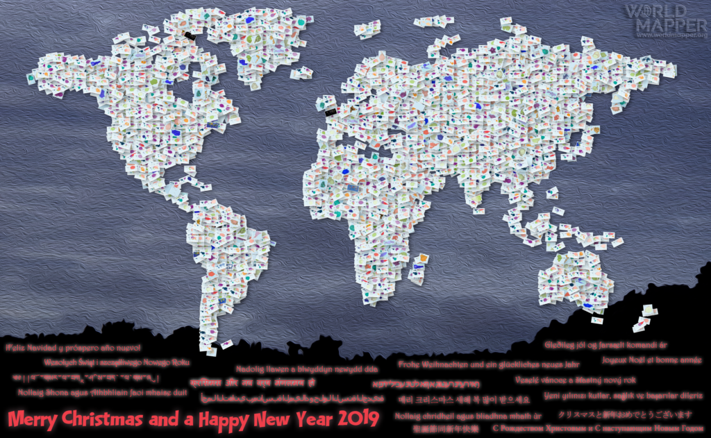
2018 has seen the new Worldmapper come to light, which is also why this blog has become a bit more quiet in recent months. This year’s Christmas greetings show a collage of the 569 new maps that we have published on Worldmapper since its launch in April:
 Continue reading
Language Diversity
There are approximately 7,000 languages believed to be spoken around the world. Despite this diversity, the majority of the world’s population speaks only a fraction of these languages. The three largest language groups (Mandarin, Spanish, and English) are spoken by more than 1.5 billion people. Other estimates state that 2/3 of the world’s population share only 12 languages.
But it is the diversity of the languages spoken by the few that makes language a remarkable cultural phenomenon. It is estimated that about 96 per cent of the languages are spoken by only 3 to 4 per cent of the people. 2,000 of the world’s languages have less than 1,000 native speakers.


