The 2018 Winter Olympic Games in PyeongChang have come to an end. Branded as the ‘Games of new horizons’, they were as much about politics as they were about actual sports. The following cartogram series focuses on the sports side of the games, showing the distribution of medals that were awarded during the games. The maps show each country resized according to the number of medals received by each country (with the Olympic Athlete from Russia shown as Russia):
Tag Archives: world
Rio 2016: Medals vs Athletes

Alternative ways of presenting the results of the Olympics has become more popular in recent years. Google – as other media outlets – did alternative medal counts allowing you to rank the medals not by their absolute numbers, but by other indicators such as population, GDP, or even more quirky themes such as fans or healthy eating. Continue reading
Rio 2016 Olympic Medal Maps
The Rio Olympics, the first on the South American continent, ended after a total of 972 medals were handed out in 306 events. Approximately 11500 athletes competed in 28 sports for a total of 306 gold, 307 silver and 359 bronze medals. The following cartogram series sums up the most successful of all participating countries by resizing each country according to the number of medals going to athletes from there:
Rio 2016: Participants and All-Time Medals
Rio 2016, this year’s Summer Olympic Games are about to start. Following the suspension of a large number of Athletes from the Russian team, 11239 athletes are participating in the event, competing for 306 sets of medals. The following map gives an overview of where participants at this year’s event are from, still proving the overall picture of previous games with the wealthy parts of the world dominating the picture, but this year also with a larger number of athletes from South America and especially from Brazil as the host nation. Brazil as the host nations did not have to go through all qualifying rounds and received automatic entry in some disciplines. Also shown in this image is the all-time medal count from all modern Summer Olympics (1896 to 2012) as proportional circles on top of each country:
World at war: Global refugee trends
 The UNHCR Global Trends 2014 Report released earlier this week by the UN High Commissioner for Refugees finds that “wars, conflict and persecution have forced more people than at any other time since records began to flee their homes and seek refuge and safety elsewhere“.
Commemorating World Refugee Day, UN High Commissioner for Refugees António Guterres declared in a statement that “around the world, almost 60 million have been displaced by conflict and persecution. Nearly 20 million of them are refugees, and more than half are children. Their numbers are growing and accelerating, every single day, on every continent.” But while the ‘western’ media takes an often embarrassingly western-centric view, and European politicians struggling to find solutions to this global crisis, the report also shows how big this human crisis really has become.
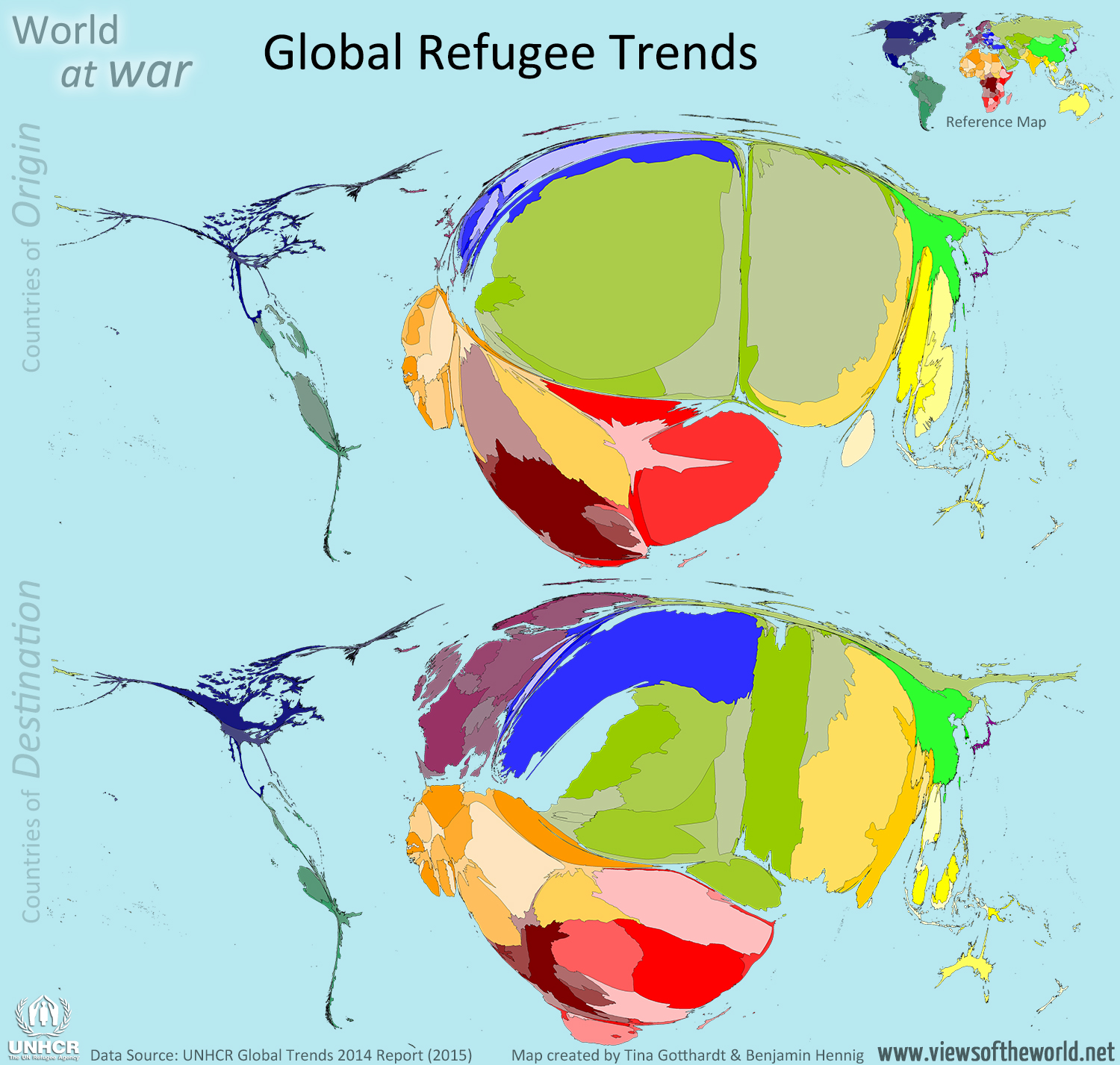
The following two cartograms show the most recent picture of global refugee trends in 2014 as published in the 2015 UNHCR report. The two maps use the total numbers for ‘refugees and people in refugee-like situations’ according to their country of origin and destination and resizes each country according to its absolute number of refugees. Excluded in these maps are those refugees whose origin is unknown or who are stateless or cannot be assigned to a specific country:
Where the Wild Spaces Are: Un planeta salvaje
Make the world a wilder place | Por un planeta más salvaje

Wilderness and remote areas are a diverse element in the patchwork of spaces that form the land surface of our planet. Only very small amounts of people are living in sparsely populated areas, which is an expression of the strong organisation of human societies to maximise those living in close relative proximity. More than half of the world’s population now lives in areas categorised as cities, and although more than 95% of the world’s population live in approximately only 10% of the land area, the remaining 90% of space on land are far from being uniform remote or even wild areas.
There are very different ways of how the un-built area that still makes the largest share of land can be understood in terms of being under influence and in reach of human civilization. Only 15% of people in rich countries live more than an hour of travel time from a city (of at least 50,000 people), while the same applies to 65% of people living in the poor countries of the world. This paper demonstrates a different approach to visualising and understanding these loneliest places on the planet by using a technique called a gridded cartogram transformation. The following map shows a gridded cartogram visualising the relative distance of areas to the majority of people. The maps derived from the distorted grid show the physical space transformed according to the absolute travel time that is needed to reach the nearest major city by land transport averaged over the area of a grid cell, resulting in a map that gives the remotest places most space and provides a unique new perspective on the spatial dimension of remoteness:


