
This is the Icelandic version of a poster on mapping wilderness and remote areas created for the the 2016 Science Day at the University of Iceland (Vísindadagur Verkfræði- og náttúruvísindasvið, Háskóli Íslands):
Víðerni og afskekkt landsvæði ná yfir margbreytileg svæði á yfirborði jarðar. Slík svæði eru strjálbýl og eru að hluta til afsprengi af skipulagi sem hvetur til þéttingar byggða. Yfir helmingur jarðarbúa í dag býr á svæðum sem skilgreind eru sem borgir, og meira en 95% jarðarbúa býr á um 10% af yfirborði lands. Hin 90 prósentin eru þó fjarri því að vera einsleit víðernissvæði, Það eru mismunandi skoðanir á því hvort og þá hvernig eigi að nýta hin óbyggðu svæði heims.
Aðeins um 15% fólks í ríkari hluta heimsins býr í meira en klukkustundar fjarlægð frá næstu borg. Í fátækari hluta heimsins er hlutfallið 65%. Hér er kynnt nýstárleg nálgun á myndrænni framsetningu og skilningi á hinum afskekktu landsvæðum jarðar sem eru að líkindum hennar síðustu víðerni. Notuð er tækni sem kalla má „bjöguð hnitvörpun“ (gridded cartogram transformation). Tæknin er notuð til kortleggja hversu fjarlæg svæði eru í hugum meirihluta mannkyns. Niðurstöður sýna umfang afskektra svæða eins og það birtist með tilliti til ferðatíma til næstu borgar, hvort sem er yfir land, vötn eða sjó. Stærð hverrar svæðiseiningar byggir á útreikningi þess tíma. Kortið gefur afskekktum svæðum aukið rými og veitir nýja sýn á svæðisbundið umfang afskekktra svæða í hlutfalli við þéttbýl svæði.
Tag Archives: poster

Urbane Veränderungsprozesse in Stadtregionen Deutschlands
Read/cite the original publication here:
Hennig, B.D. (2018): The growth and decline of urban agglomerations in Germany. Environment and Planning A: Economy and Space. DOI:10.1177/2F0308518X18798835
Hennig, B.D. (2018): The growth and decline of urban agglomerations in Germany. Environment and Planning A: Economy and Space. DOI:10.1177/2F0308518X18798835
This is a German-language poster contribution looking at processes of change in the major urban agglomerations in Germany and novel ways of visualising these using cartogram visualisation techniques. Continue reading
Where the Wild Spaces Are: Un planeta salvaje
Make the world a wilder place | Por un planeta más salvaje

Wilderness and remote areas are a diverse element in the patchwork of spaces that form the land surface of our planet. Only very small amounts of people are living in sparsely populated areas, which is an expression of the strong organisation of human societies to maximise those living in close relative proximity. More than half of the world’s population now lives in areas categorised as cities, and although more than 95% of the world’s population live in approximately only 10% of the land area, the remaining 90% of space on land are far from being uniform remote or even wild areas.
There are very different ways of how the un-built area that still makes the largest share of land can be understood in terms of being under influence and in reach of human civilization. Only 15% of people in rich countries live more than an hour of travel time from a city (of at least 50,000 people), while the same applies to 65% of people living in the poor countries of the world. This paper demonstrates a different approach to visualising and understanding these loneliest places on the planet by using a technique called a gridded cartogram transformation. The following map shows a gridded cartogram visualising the relative distance of areas to the majority of people. The maps derived from the distorted grid show the physical space transformed according to the absolute travel time that is needed to reach the nearest major city by land transport averaged over the area of a grid cell, resulting in a map that gives the remotest places most space and provides a unique new perspective on the spatial dimension of remoteness:

Mapping a (un)happy humanity: a new perspective on our planet’s well-being
Happiness and well-being found their way back into public debate in the UK with Prime Minister David Cameron wanting well-being to become a measure to steer policy. Maybe he was inspired by his recent trip to the G20 meeting in Asia: On the Asian continent lies the first country to have introduced Gross National Happiness as a measure for the country’s development – rather than economic growth, like we keep on doing. Happiness as the new economics is an appealing thought, but it is hard to imagine any major economy looking at happiness instead of money any time soon. And if so, how would the world look like? Happiness is hard to measure, and hence data is hard to get. One way to look at the well-being around the world provides the Happy Planet Index by the nef (new economics foundation).
Last year Sheffield University’s CWiPP is holding an exhibition at the ICOSS to mark the re-launch of the centre. My poster showing a new map of the Happy Planet Index was part of the exhibition:
![]() Download poster as PDF
Download poster as PDF
happy planet")
This map is also featured in the News section of the Happy Planet Index homepage.
Update March 2011: I have given a talk explaining the methodological background and the thematic relevance of the map at the IDEA CETL Seminar Series (University of Leeds). The slides of this talk are available here:
Mapping people, not sheep: Why our planet’s well-being can look so different
Update March 2011: I have given a talk explaining the methodological background and the thematic relevance of the map at the IDEA CETL Seminar Series (University of Leeds). The slides of this talk are available here:
Mapping people, not sheep: Why our planet’s well-being can look so different
The content on this page has been created by Benjamin Hennig. Please contact me for further details on the terms of use.
Gridded Cartograms and the World Population Atlas
For this year’s 46th Annual Summer School of the Society of Cartographers I recalled the making of the World Population Atlas and wrapped all material up for some contributions for the meeting. The outcome are two new posters and a presentation for the delegate’s session:
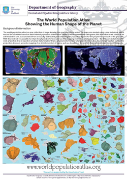 Poster: The World Population Atlas |
 Poster: Creating Gridded Cartograms |
The content on this page has been created by Benjamin Hennig. Please contact me for further details on the terms of use.
Geovisualisation of flows
 This is some material from my first year of PhD-research in the Worldmapper project (funded by the Leverhulme Trust):
“Geovisualisation of flows: Finding new approaches to map an interdependent world” – Poster display at the RGS Annual Conference in Manchester, 26-28 August 2009
![]() Download poster as PDF
Download poster as PDF
Slides of my postgraduate presentation at the Department of Geography, University of Sheffield, 26 May 2009 (also accessible on Slideshare):
The content on this page has been created by Benjamin Hennig. Please contact me for further details on the terms of use.