
Two years after Obama has been elected president, another political change has come to the United States in this year’s midterm elections. Politically most significant will be the changed balance of power in the House of Representatives, which has now a majority for the Republican party (winning 240 of the seats, compared to 186 going to the Democrats, and 9 undeclared at the time of writing). Unlike the seats in the US Senate (with still a small majority for the Democrats), the share of seats in the Congress reflects roughly a quite equal population. The congressional districts, which are the decisive constituencies for the House of Representatives, are thus reflecting a general image of the political mood in the US (while the Senate is composed of two Senators for each State, regardless of the population).
Therefore it makes sense to create a different map of the election results for the House of Representatives in order to show a population-centric view of this year’s midterm. The following map uses a gridded population projection and maps the election results onto it, so that it shows the proportional population share of the results in its true dimension: Each person on the following map has the same space, so it reflects the number of people represented by each member of congress. To see where changes took place, different shadings of red/blue have been used in addition. The map uses the same colour key as the election maps on the Guardian website – their map allows you to identify any of the States and gives further details on the results for each electoral district.
This is how the results from the election to the House of Representatives in the 2010 Midterm elections of the United States look like on a population projection (a geographical view with a conventional map is included as an inset to allow comparison with the more commonly used maps):

The base for this transformation is an equally distributed population grid showing the population distribution within the United States. To find out more about this projection, have a look at this animation shown earlier this year at the AAG conference in Washington DC: From land area to people – how a gridded cartogram evolves from a conventional map. There are also plenty of other posts on this website dealing with the issue of gridded cartograms.
To make the underlying grid visible, I have also created a second version of the above shown map that includes the grid on top of the map – this helps to identify the areas that are distorted most, although the constituency boundaries of the congressional districts already indicate this in a similar way. However, these districts are not the base for the map transformation (like most other cartograms actually are created), so that the following map gives the complete picture of the election cartogram for the House of Representatives:
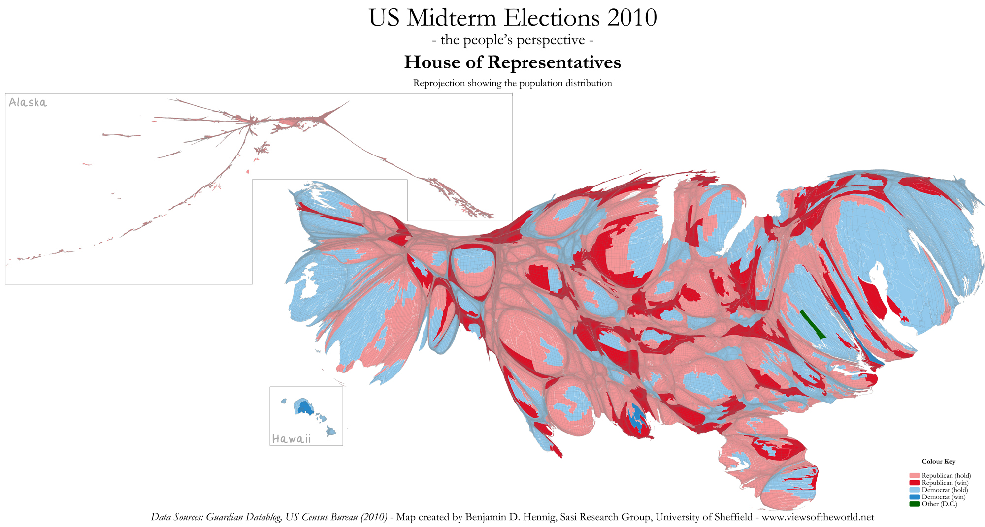
At a first glance, these maps are very similar to the election cartograms of Michael Gastner – apparently, both maps incorporate the Gastner/Newman density equalising algorithm to create the final map. The differences become apparent when looking at the maps in more detail: Gastner’s map use the congressional districts as a basemap, which are all transformed to create an equal area (as each district reflects one seat in the congress). In contrast, the maps shown here use an equally-distributed grid for the distribution, with each grid cell containing the number of people living in there, so that the geographical reference in preserved in the grid (and the transformation refers closer to the real population distribution). This can be seen most significantly when looking at Alaska: In the real population distribution the dominance of the people living in the southern parts of the state, whereas Gastner’s maps preserve the original shape of Alaska instead. In the contiguous states, many more of these differences can be spotted when looking at the differing shapes in more detail.
The distorted shapes (such as that of Alaska) may be seen as a disadvantage – one needs to get used to this projection in order to better understand the maps. Therefore preserving the geographical reference has the advantage of being independent from any administrative boundaries (such as those of the congressional districts): The shape of these maps always stays the same, no matter how administrative boundaries are set. Differently sized map units are no longer important, as the grid is the decisive element of these maps.
The content on this page has been created by Benjamin Hennig. Please contact me for further details on the terms of use.
Pingback: British Views of the World 2010 - Views of the World