Climate change has hardly been on the agenda of global politics recently. It was the global downturn which keeps country leaders busy, and so prospects for the current climate change talks in Cancun (Mexico) to find a successive agreement for the Kyoto protocol appear quite poor. While the Copenhagen summit in 2009 was accompanied by large hope (and failed miserably), there are much lower expectations this year, although still some hope for a significant outcome.
It is interesting to look at the number of delegates which a country is able to send to the talks, as this reveals a lot about the interests of the nations that will succeed in the negotiations. The voices which will be heard are probably the voices of those who send the most delegates, riding roughshod over those nations which have fewer representatives. But the number of delegates may also reflect the importance that climate change has on the political agenda of a country.
During the next days the summit goes into its critical phase, with (perhaps) some world leaders appearing on stage to strengthen their voice – but will those voices from the most vulnerable countries be heard? This is the map of the number of delegates in this year’s climate change talks (data obtained from the UNFCC, the map has been cated in collaboration with UNfair play):
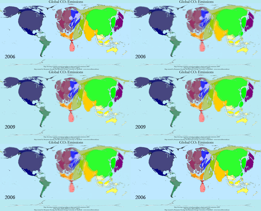
And there is a lot to discuss in Cancun, not least because developments look bleak when looking at the latest figures on carbon emissions: A year ago on the occasion of the Copenhagen summit I published an updated map on the global carbon emissions. I also did a new map depiction modelling the carbon emissions onto a grid which gave a clearer picture of the geographical variation of these emissions. The figures back then were based on UN data for 2006, so that since than inevitably many inquiries came in asking for a more recent map.
Combining several data sources (mainly UNStats and IWR) and taking the just released Update on CO2 emissions (by Friedlingstein et al published in Nature Geoscience) we now updated our worldmapper base data to a consistent data set which allows us to draw a more recent picture of carbon emissions amid the economic recession. The map reflects the findings in the above mentioned paper: Despite the slowdown in global production, global emission rates continue to rise. The research also confirms a simultaneous development of carbon emissions and GDP, resulting in often only moderate reductions of emissions in most affluent countries and continued increases in many emerging economies. According to their estimates, 2010 may become the year with the highest anthropogenic carbon emissions in history – a new piece of history, just as the Kyoto Protocol. Did anyone say something about an economic crisis? What would the world look like without a crisis? Perhaps the next years will tell us…again. – Here is the updated map and below a short animation showing the slight changes from 2006-2009:
Carbon Emissions 2009:

(click for larger version)
Animation CO2-Emissions 2006-2009:

 The updated carbon emission map has also been featured in German AKTIV newspaper (Issue 25/2010) who made a feature on the Cancun summit. The article is available online at http://www.aktiv-online.info and as a pdf download from worldmapper.
The content on this page has been created by Benjamin Hennig. Please contact me for further details on the terms of use.

