
Where rain (or more precisely: precipitation) is affecting most people, and where it falls mainly on uninhabited land has been part of the presentation that I gave at this year’s SoC meeting in Plymouth (where the delegates witnessed some of the rain from the maps shown below, but enjoyed a little bit of the late summer’s sunshine as well). An animation of these maps and the annual precipitation map have been published on this website last week (see here).
The following series of maps shows monthly precipitation patterns derived from monitored climate data of approximately 50 years (1950-2000, data obtained from http://worldclim.org/). The underlying popoulation grid is a gridded cartogram transformation of the global population distribution population data from SEDAC). As explained in more detail in the previous entry, this representation is a view of how the world’s population is directly exposed to the monthly precipitation patterns, shrinking all those unpopulated parts of the land surface while proportionally increasing the size of land according to the total number of people living there. The choropleth overlay visualises precipitation just as in a conventional map (also shown in the inset map. This shows, when it rains on humanity throughout the year – month by month:
January

(click for larger map)
February

(click for larger map)
March

(click for larger map)
April

(click for larger map)


August

(click for larger map)
Now it comes to the month we are currently in. From a global perspective, we can now see the slow retreat of the Asian monsoon, which still is still influencing the region but should now slow down and bring the dryer seasons in the forthcoming months. In North America, Hurricane season has started with some significant amounts of rain along the east coast already. And in the UK, we start to get a little bit more wet while the remains of those hurricanes head east over the Atlantic.
September
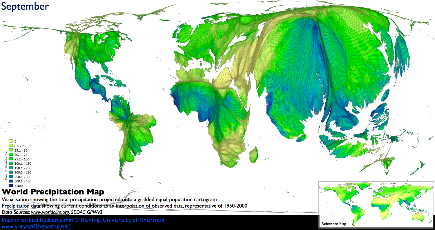
(click for larger map)
October

(click for larger map)
November

(click for larger map)
December

(click for larger map)
To complete the picture of this map series, the following map again shows the annual precipitation in the same projection. The scale is adjusted to the higher total annual rates – the map is basically an addition of the precipitation amounts of all the single maps shown above. While the annual map helps us to understand the relation of human population patterns in relation to population (which can partly be explained by climate conditions, although that is only one small part of explaining where people live), the monthly maps give us a much better picture of the variation and the changing conditions thoughout the year: Some places like the tropics hvaing large amounts of rain get this evenly throughout the year, while other parts, such as the Asian monsoon regions receive most of their precipitation in a comparably short amount of thime. Only the combination of both views can help us to understand the full picture of where and when precipitation is important for the world’s population.
Annual Precipitation

(click for larger map)
An animated version of these maps can be watched on YouTube.
The content on this page has been created by Benjamin Hennig. Please contact me for further details on the terms of use.