UK elections: 2005 and 2010

Now that you know the results of the general election, and also had a look back at earlier elections, see here what has really changed: This is a short animation shows the British general election results in relation to the population distribution from 2005 transforming into the 2010 results and back in a loop:

Changing election landscape in Britain 2005-2010
(click to view larger version)

If the animation doesn’t start straight away, give it a few seconds or minutes to load completely. It has 7 MB in size and may take a while depending on the speed of your internet connection.

The content on this page has been created by Benjamin Hennig. Please contact me for further details on the terms of use.

British General Election Results 2010

Decision day is gone – and no decision on the future administration yet. The British General Election will be keeping us (and the politicians) busy for a while, so there is plenty of time for an analysis of the election results. This map shows the winning parties in all constituencies (the results from Thirsk & Malton where added on May, 27) mapped on the gridded population cartogram of Great Britain.

Winners of the British General Election 2010 mapped on a gridded population cartogram(click map for larger view)

Technical notes: This cartogram reflects the real population distribution in Great Britain and thus the total number of people living in an area. Each grid cell thus represents the same physical area, but is resized according to the number of people living in this area. We used the British National Grid as a reference projection. More gridded cartograms and further information on the techniques that we used to create these maps can be found on the worldmapper website at http://www.worldpopulationatlas.org/.

The content on this page has been created by Benjamin Hennig. Please contact me for further details on the terms of use.

A History of Election Results in Britain

The Road to No 10 is a rough one, full of potholes this year. And as everyone’s waiting for the results of the General Election 2010, there are still a few hours left to have a look at election results in retrospect. The following maps step back in history. On the first map we show a representation of the winning party in a constituency projected on a gridded population cartogram – click the map for a large version of the map:
Winners of the British General Election 2005 shown on a gridded population cartogramThe left of the following two maps shows the total number of (then winning) Labour votes in the 2010 election, projected onto the UK’s population cartogram and thus giving a clue of the relation of Labour support to the population distribution back in those days. The right map is an animation of all election results since 1832, with each circle representing one constituency (this map is a previous work of the Sasi Research Group).

Total numbers of Labour votes in the UK 2005 General Election
(click for larger view)
Results of the General Elections in Great Britain from 1832 to 2005
(click for larger view)

For those few undecided or those who are bored waiting for the results: Watch this talk on Tackling Social Inequality – Will your vote make a difference?

The content on this page has been created by Benjamin Hennig. Please contact me for further details on the terms of use.

German constituencies and their population

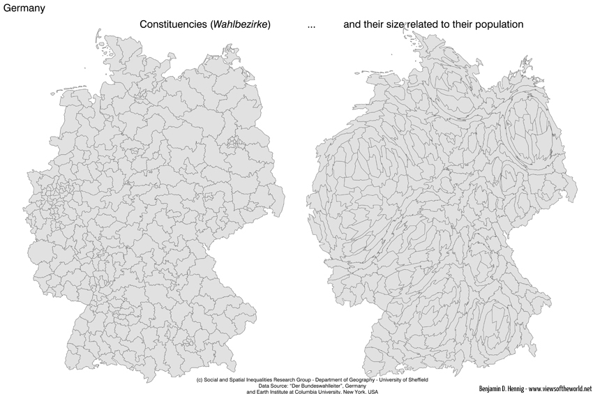
Today is election day in Germany. So let’s have a closer look at the constituencies (Walbezirke) for this year’s general election – and how they actually look like in their real extent when showing their population size (click the image to see an even larger map):

German Constitutencies / Wahlbezirke

The content on this page has been created by Benjamin Hennig. Please contact me for further details on the terms of use.