Gridded cartogram tutorial

This is a short slideshow showing the basic steps that are needed to do your own gridded population cartograms (with a quite rough 1 degree grid – good for starting with this whole thing). Software needed for this simple click-through tutorial are ArcGIS and ScapeToad. If you want to go one step further, I’d recommend using the ArcScript Cartogram Geoprocessing Tool by Tom Gross, even though this is not featured in this demo:

The tutorial was given in October 2009 to students of the Module GEO6016 Data, Visualisation and GIS in the MSc in Social and Spatial Inequalities at the University of Sheffield.

The content on this page has been created by Benjamin Hennig. Please contact me for further details on the terms of use.

The United Kingdom within the world’s demographic change

Population growth in Britain? Decline in Europe? Where does the UK stand, and what implications does this have for politics? A population crash and an ageing population require political action. This slides by Danny Dorling and me, presented at the Royal Commission on Environmental Pollution, provides an insight into the current trends:

Update February 2011: Read more about the release of the Royal Comission’s final report on Demographic Change and the Environment (for which this presentation was prepared for)

The content on this page has been created by Benjamin Hennig. Please contact me for further details on the terms of use.

Carbon emissions on a grid

Building upon the maps in the previous post we also created a gridded cartogram showing the national per capita emissions joined with the earlier introduced population grids. The resulting map gives an indication of the areas where most carbon emissions are produced beyond country boundaries:

Carbon Emission Grid

The content on this page has been created by Benjamin Hennig. Please contact me for further details on the terms of use.

Copenhagen Carbon Maps

Carbon dioxide emissions are gaining yet another boost of attention in the countdown to the Copenhagen climate change summit. We took that as an opportunity to update our worldmapper carbon emissions map with more recent figures. The most reliable figures are compiled in the UNStats MDG reports providing global data for 2006. Using this dataset, we calculated the new Carbon Emissions Map, resizing the territories according to the proportion of carbon dioxide emissions (note: see more maps here):

Carbon Dioxide Emissions 2006

Furthermore, we did some calculations to show the real dimension of CO2 emissions by the population in each of the countries (or territories). We re-coloured the previous map with per capita greenhouse gas emissions. These give us an indication how the major polluters compare related to their population’s individual levels of emissions:

Per Capita Carbon Dioxide Emissions 2006

Finally, any agreements in Copenhagen will be compared to what the Kyoto protocol proposed some 17 years ago. This refers to the 1990 levels of CO2 emissions, which we put on a third map: Again, we took the per capita consumption as a base for the colours, rather than the change in total emissions. In this map we can see which countries have improved their carbon dioxide footprint on an indiviual level copared to the per capita emissions in 1990 and which have changed for the worse:

Carbon Dioxide Emissions 2006 with changes between 1990 and 2006

The content on this page has been created by Benjamin Hennig. Please contact me for further details on the terms of use.

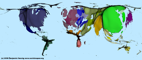
Map meets cartogram

Population densities can of course be mapped differently – obviously using common density maps. They can give a better clue where densities are highest, but they can hardly show what is behind those numbers: What does a certain density really mean? How many are the many that are living in the more dense areas? And how do those compare to other populated areas? This is what a cartogram can show far better – and also show more true, when mapping human-related figures.
The following map shows a density map compared to our UK population cartogram. None of these maps is worse or better, it all depends on the purpose what you want to show, so that our new maps do not supersede traditional mapping approaches…
UK maps compared
The content on this page has been created by Benjamin Hennig. Please contact me for further details on the terms of use.

German election 2009 – Part III

In the last series of maps we are now doing a more indepth look at the German general election results. The following maps are all based on the second vote (Zweitstimme) and map these in various ways. To get a more precise view on what the majority of people decided for on the ballot, this time more than one party is mapped. This makes the maps more complex, but with the distinct colour scheme they remain understandable and show the results in a more differentiated manner. Click each map to get a closer view (in these maps quite important as colours might appear blurry in the shrinked maps shown on this page).
Except for the last two, all maps use the previously introduced population cartogram as their main projection, so that the proportions show the real population distribution.
On the first map, the largest parties in each constituency are included up to at least 50% of the votes. Usually these are the 1st and 2nd largest party – only few exceptions can be seen in the south, where CSU managed to get more than 50% of the votes in some areas:

Bundestagswahl: Erster und Zweiter Sieger (equal symbol) Continue reading