Germany’s Topography

While the polls are closed now, politicians are experiencing their personal highs and lows. But what about the population. What highs and lows are the people experiencing? Let’s now have a look at this as well. Here are an elevation map of Germany and a grid-based cartogram showing where and at which elevation most people are living at in Germany (click the image for a larger verson of the maps):

Elevation maps of Germany

An improved and more detailed version of this map can be found here:
The Human Shape of Germany
The content on this page has been created by Benjamin Hennig. Please contact me for further details on the terms of use.

German constituencies and their population

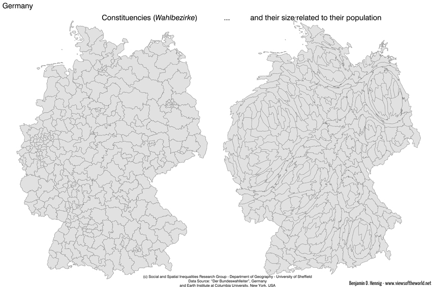
Today is election day in Germany. So let’s have a closer look at the constituencies (Walbezirke) for this year’s general election – and how they actually look like in their real extent when showing their population size (click the image to see an even larger map):

German Constitutencies / Wahlbezirke

The content on this page has been created by Benjamin Hennig. Please contact me for further details on the terms of use.

Population Potential of Germany

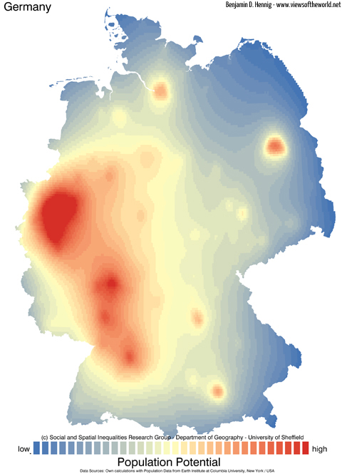
Most Germans are eagerly awaiting the outcomes of the general election – but where are they all living and how does this country between East and West look like today? Let’s have a closer look and start with the country’s population potential:

Population Potential of Germany

The content on this page has been created by Benjamin Hennig. Please contact me for further details on the terms of use.

Geovisualisation of flows

Geovisualisation of flowsThis is some material from my first year of PhD-research in the Worldmapper project (funded by the Leverhulme Trust):
“Geovisualisation of flows: Finding new approaches to map an interdependent world” – Poster display at the RGS Annual Conference in Manchester, 26-28 August 2009
pdf icon Download poster as PDF

Slides of my postgraduate presentation at the Department of Geography, University of Sheffield, 26 May 2009 (also accessible on Slideshare):

The content on this page has been created by Benjamin Hennig. Please contact me for further details on the terms of use.

Re-Mapping the World’s Population

“Re-Mapping the World’s Population” – Presentation at the ESRI International User Conference in San Diego, 13-17 July 2009

Abstract:
The Worldmapper project has successfully produced a series of maps to visualize data, concerning a range of issues facing the modern world, based upon the idea of density-equalising maps. The Cartogram Geoprocessing Tool incorporating this density-equalising method has also recently been made available for ArcGIS. This presentation introduces and evaluates further new mapping approaches that move depictions beyond their simple descriptive form. It gives an insight into these new developments, focusing on sub-national level data which has until now been neglected. The world population cartogram demonstrates the first attempt to include sub-national density data. Within this approach, ArcGIS 9.3 plays a crucial role as an interface to convert suitable raster datasets and to produce updated cartograms. The data is converted using ArcMap’s Toolbox, while the Cartograms, due to their large size were, calculated in a Unix environment. The final visualization has been conducted in ArcMap.

pdf icon Download paper as PDF

(published 2009 in the ESRI User Conference Proceedings)
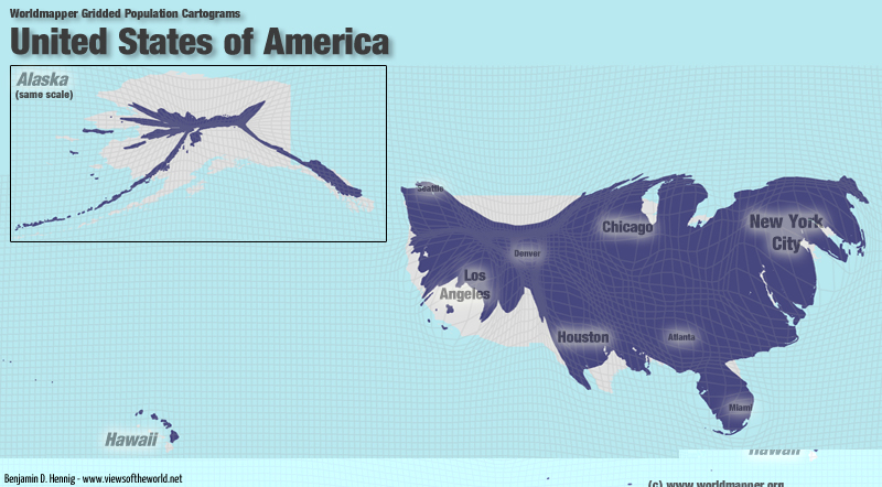
USA Population Cartogram

These are the slides from my talk:

The content on this page has been created by Benjamin Hennig. Please contact me for further details on the terms of use.