Nativity map: The Census of Quirinius revealed

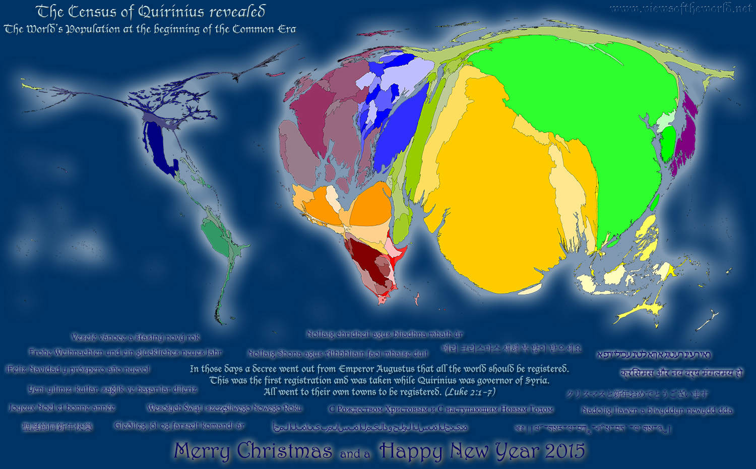
The first two chapters of the Gospel of Luke in the Bible state that the birth of Jesus took place at the time of the census: “In those days a decree went out from Emperor Augustus that all the world should be registered. This was the first registration and was taken while Quirinius was governor of Syria. All went to their own towns to be registered.”
Believing in the religious background of the nativity story or not, evidence for the Census of Quirinius following Caesar Augustus’ decree exists beyond the bible. However, despite all recent initiatives to open up public data, the Census results of back then have not seen the light of day…until now!
This Christmas we can reveal the results of the Census of Quirinius following a freedom of information request to the Roman Empire (well, and following some more in-depth analysis within the Worldmapper project using Angus Maddisons studies). This is how the world looked in the year 1 CE (3761 Hebrew calendar, 7.17.18.13.3 Mayan calendar, 544 Buddhist calendar):


(click for larger version)

Wishing everyone a happy new year!

Continue reading

Born abroad: A look at the Population of the UK

According to a BBC News feature, “trends in migration are changing. Once, migrants from the same country tended to cluster in areas where they had relatives or friends. But new maps of England and Wales, reveal that for more recent migrants this is no longer the case” The maps of which this quote speak are a short series of cartograms created in collaboration of the BBC with the University of Sheffield in which we took a look at the first set of data from the 2011 Census in the United Kingdom (with much more detailed statistics due early next year). This is how some of the trends analysed by the BBC look like, using a gridded population cartogram of the country as a basemap for the lower maps shown here:

Cartogram / Map series of people born abroad according to the 2011 UK Census

Continue reading

Counting the US population

Around the world countries are counting their people in the national censuses. The world’s largest country China aims to chart its shifting population, so does the second largest nation India (who also just released their latest tiger census results), Germany takes a deeper look into its shrinking population for the first time since 1987, while the United Kingdom looks at its still growing population. These are just some of the example for the currently ongoing latest rounds of censuses around the world which will also lead to significant updates of global socioeconomic data which has been used for the realisation of the worldmapper project.
The USA is one of the first countries to have completed their latest 2010 census and recently started publishing the figures from last year’s population count. Among the first numbers released are the population counts, which draw the most up-to-date picture of the US population distribution and does also allow to analyse the changes since the last census took place in 2000. The following map uses these figures and shows the US population in cartogram form based on the state level figures. The main map shows each state resized according to the total number of people living there, and colours the states by their relative change (in percent) compared to the 2000 population. The upper left map inset shows the same map, colouring the states by their total population changes in that 10 year period. The bottom right map inset resizes the states according to the total population changes that took place between 2000 and 2010, and colours the relative change on top of that:

Population Map / Cartogram the USA
(click for larger map)

Continue reading