A population-centric map projection

Here is some material from a presentation at this year’s  AAG Annual Conference in Washington DC. The presentation People powered maps: A population-centric map projection was given in the session on Topics in GIS, Remote Sensing, and Spatial Analysis and showed some new works on our grid-based cartograms (as presented at GISRUK 2009 and ESRI UC 2009).
The following animation shows the transformation of a topographic map of the United States, ending in a grid-based population cartogram (and then reversing). Please notice that loading the animation takes a while on slower internet connections:

USA Animated Population Cartogram with Topography
(click for larger view)

This is the full presentation given at the AAG Meeting. Please note that the animated parts such as the above animation are not shown in this Slideshare version:

The content on this page has been created by Benjamin Hennig. Please contact me for further details on the terms of use.

The Population of the Island of Ireland

This map is not yet shown in worldmapper’s collection of country cartograms, as we don’t show maps of larger islands there if they are politically divided. As the Irish Islanders are all celebrating their culture today, here is how the full island’s population distribution looks like in the worldmapper gridded cartogram style:

Happy Paddy’s Day…
Update 2011: See a new version of this map using a NASA satellite image here.

The content on this page has been created by Benjamin Hennig. Please contact me for further details on the terms of use.

ArcUser article: Re-Mapping the World’s Population

My contribution to the ESRI UC 2009 found its way into the Winter 2010 edition of ArcUser:

  • Hennig, B.D., Pritchard, J., Ramsden, M., and Dorling, D. (2010). Remapping the World’s Population. Visualizing data using cartograms. ArcUser 2010 (1), 66-69.
    pdf icon Article as PDF ; Article online
  • The slideshow from last year’s talk at the ESRI UC Is now also available online to watch on Slideshare:

    The content on this page has been created by Benjamin Hennig. Please contact me for further details on the terms of use.
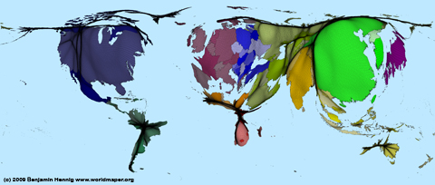
    Gridded cartogram tutorial

    This is a short slideshow showing the basic steps that are needed to do your own gridded population cartograms (with a quite rough 1 degree grid – good for starting with this whole thing). Software needed for this simple click-through tutorial are ArcGIS and ScapeToad. If you want to go one step further, I’d recommend using the ArcScript Cartogram Geoprocessing Tool by Tom Gross, even though this is not featured in this demo:

    The tutorial was given in October 2009 to students of the Module GEO6016 Data, Visualisation and GIS in the MSc in Social and Spatial Inequalities at the University of Sheffield.

    The content on this page has been created by Benjamin Hennig. Please contact me for further details on the terms of use.

    Carbon emissions on a grid

    Building upon the maps in the previous post we also created a gridded cartogram showing the national per capita emissions joined with the earlier introduced population grids. The resulting map gives an indication of the areas where most carbon emissions are produced beyond country boundaries:

    Carbon Emission Grid

    The content on this page has been created by Benjamin Hennig. Please contact me for further details on the terms of use.

    Map meets cartogram

    Population densities can of course be mapped differently – obviously using common density maps. They can give a better clue where densities are highest, but they can hardly show what is behind those numbers: What does a certain density really mean? How many are the many that are living in the more dense areas? And how do those compare to other populated areas? This is what a cartogram can show far better – and also show more true, when mapping human-related figures.
    The following map shows a density map compared to our UK population cartogram. None of these maps is worse or better, it all depends on the purpose what you want to show, so that our new maps do not supersede traditional mapping approaches…
    UK maps compared
    The content on this page has been created by Benjamin Hennig. Please contact me for further details on the terms of use.