
499 years after Mercator’s birth we may feel that the age of discovery is long gone. We seem to have explored almost every patch of our planet, considerably supported by Mercator’s famous world map that allowed sailors for the first time to reliably navigate across the world’s oceans. His innovation was a significant contribution to the early days of globalisation. Globalisation has turned our planet into a human planet, where people have become a substantial component of the processes that influence our livelihoods – some go as far as calling this a new geological era, the anthropocene. But while we have maps and images of every spot of the earth, we do not fully understand the human environments and interrelations to the natural environment. Normal maps show where sheep and other lovely creatures of nature live but hide much of the so important populous spaces of humanity.
The maps that I created as part of my PhD research are based on a novel cartogram mapping technique, deploying Gastner/Newman’s diffusion-based cartogram algorithm in a new way. The maps give every person living on this planet the same amount of space, while reducing the least populated places to a minimum. The map projection is calculated from an equally distributed population grid so that, unlike in other cartograms, the transformed grid cells preserve an accurate geographical reference. This allows us to map a diverse range of geographical layers on top of the population projection. The new maps show the social and physical environment in relation to population and provide a fresh perspective on the complex geography of the 21st century world. The following animation shows a series of maps that demonstrate the visual capabilities of the technique (the video can be switched to HD resolution by clicking the 360p note in the bottom panel):
Just as Mercator’s world map was a very helpful tool in an era of discovery, the new gridded world population cartogram is a helpful basemap to look at the world from the view of people. By looking at the geography of the planet on a population cartogram we can better see and understand where people live in relation to nature, and which patterns shape the globalised world. We start to realise that there are people far less connected to the global flows of money, goods, or air traffic in this so-called interconnected world. We see where many people have to live without lights at night, where few people make lots of money, and where many people have so much less. We can start to understand where most people are at risk of earthquakes and of rising sea levels. This can all be seen by slightly changing the view and putting people into the focus of the map projection. Mercator’s world map may not have become redundant, but it is about time that we show the human planet in novel ways to better understand the space that matters most to us: the human space.
Like other map projections, these maps have a distinct geography with a very high accuracy that can be traced back to its origins in the physical space. The following animation shows, how a ‘normal’ map projection transforms into a gridded world population cartogram (the video can be switched to HD resolution by clicking the 360p note in the bottom panel):
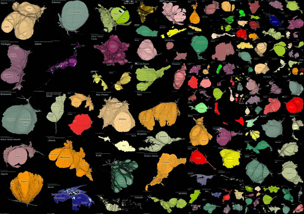
The new online world population atlas developed from this technique transfers the mapping concept to a larger scale, showing population cartograms for every country of the world. Equivalent to the gridded world population cartogram, this is the human shape of the countries. The maps show where people live and how the population is distributed within their countries. These maps must not be confused with being only maps of the cities in the world, but they show the rural populations alike. Even if we live in an increasingly urbanised world, where more than half of the world’s population now lives in cities, there are still many countries with significant rural populations (such as Cambodia or Kenya, which both have around 80% of people living in the countryside). These large rural populations are shown just as well in these maps as the urban populations of the highly urbanised countries (such as Belgium or Argentina, where more than 90% of the people live in cities).
The content on this page has been created by Benjamin Hennig. Please contact me for further details on the terms of use.
Pingback: The Power of Maps | Red (team) Analysis