
Some recent maps on this website were closely related to the direct or indirect implications that the global downturn had on people’s lives across the globe: Be it the slowed-down but still growing carbon emissions, the poor state of well-being seen from a more sustainable point of view, or the distribution of wealth.
How this all related to each other has recently been commented by Peter Victor in Nature, who argues that “our global economy must operate within planetary limits to promote stability, resilience and wellbeing, not rising GDP” (Questioning economic growth, Nature 468: 370–371).
The previously published GDP map on the global distribution of GDP for 2010 and 2015 gives a good indication how little the distribution of global wealth has changed, and where the nations of the world are that may reconsider their attitude towards further growth. The map is less useful to see the dimension of changes and to see how little things have changed so far: The rich countries getting richer and the poor countries trying to catch up with these developments – and still, rising levels of global inequalities and further socio-economic disparities. This is shown in the following map, which displays the absolute growth derived from the GDP estimates for 2010 and 2015. The map thus shows the countries resized to the total growth that is expected for all countries in the given timespan and gives a clear picture of where the growth is largest (apparently, G20 countries dominate much of this cartogram. The colour key for the countries adds another dimension by showing the rate of growth reached 2015 compared to the level of 2010, an indicator that shows the most dynamic economies in the years to come – and those which kept on producing more carbon emissions despite the recession:

Cancun Climate Change Conference
Climate change has hardly been on the agenda of global politics recently. It was the global downturn which keeps country leaders busy, and so prospects for the current climate change talks in Cancun (Mexico) to find a successive agreement for the Kyoto protocol appear quite poor. While the Copenhagen summit in 2009 was accompanied by large hope (and failed miserably), there are much lower expectations this year, although still some hope for a significant outcome.
It is interesting to look at the number of delegates which a country is able to send to the talks, as this reveals a lot about the interests of the nations that will succeed in the negotiations. The voices which will be heard are probably the voices of those who send the most delegates, riding roughshod over those nations which have fewer representatives. But the number of delegates may also reflect the importance that climate change has on the political agenda of a country.
During the next days the summit goes into its critical phase, with (perhaps) some world leaders appearing on stage to strengthen their voice – but will those voices from the most vulnerable countries be heard? This is the map of the number of delegates in this year’s climate change talks (data obtained from the UNFCC, the map has been cated in collaboration with UNfair play):

And there is a lot to discuss in Cancun, not least because developments look bleak when looking at the latest figures on carbon emissions: A year ago on the occasion of the Copenhagen summit I published an updated map on the global carbon emissions. I also did a new map depiction modelling the carbon emissions onto a grid which gave a clearer picture of the geographical variation of these emissions. The figures back then were based on UN data for 2006, so that since than inevitably many inquiries came in asking for a more recent map.
Combining several data sources (mainly UNStats and IWR) and taking the just released Update on CO2 emissions (by Friedlingstein et al published in Nature Geoscience) we now updated our worldmapper base data to a consistent data set which allows us to draw a more recent picture of carbon emissions amid the economic recession. The map reflects the findings in the above mentioned paper: Despite the slowdown in global production, global emission rates continue to rise. The research also confirms a simultaneous development of carbon emissions and GDP, resulting in often only moderate reductions of emissions in most affluent countries and continued increases in many emerging economies. According to their estimates, 2010 may become the year with the highest anthropogenic carbon emissions in history – a new piece of history, just as the Kyoto Protocol. Did anyone say something about an economic crisis? What would the world look like without a crisis? Perhaps the next years will tell us…again. – Here is the updated map and below a short animation showing the slight changes from 2006-2009:
Carbon Emissions 2009:

(click for larger version)
Animation CO2-Emissions 2006-2009: Continue reading
Qatar – A Population Cartogram
High hopes of England have vanished on today’s draw of the forthcoming FIFA Football World Cup hosts, with Russia getting the event for 2018. More surprise was caused by Qatar which will be hosting the 2022 World Cup: With an area of 11,437 sq km and a population of approximately 1.7 million people, by far the smallest World Cup host in Fifa’s history.
In fact, Qatar is so small that we didn’t even bother to put up an individual map for Quatar in the Worldmapper World Population Atlas, but merged it with Saudi Arabia and Bahrain (Russia has its own map though, despite beating England’s bid).
With its new fame, Quatar’s population shall now get its own population cartogram which gives space to all the people living there and removes all those sandy areas in the south and west. Here is the Qatar gridded population cartogram:

Mapping a (un)happy humanity: a new perspective on our planet’s well-being
Happiness and well-being found their way back into public debate in the UK with Prime Minister David Cameron wanting well-being to become a measure to steer policy. Maybe he was inspired by his recent trip to the G20 meeting in Asia: On the Asian continent lies the first country to have introduced Gross National Happiness as a measure for the country’s development – rather than economic growth, like we keep on doing. Happiness as the new economics is an appealing thought, but it is hard to imagine any major economy looking at happiness instead of money any time soon. And if so, how would the world look like? Happiness is hard to measure, and hence data is hard to get. One way to look at the well-being around the world provides the Happy Planet Index by the nef (new economics foundation).
Last year Sheffield University’s CWiPP is holding an exhibition at the ICOSS to mark the re-launch of the centre. My poster showing a new map of the Happy Planet Index was part of the exhibition:
![]() Download poster as PDF
Download poster as PDF
happy planet")
This map is also featured in the News section of the Happy Planet Index homepage.
Update March 2011: I have given a talk explaining the methodological background and the thematic relevance of the map at the IDEA CETL Seminar Series (University of Leeds). The slides of this talk are available here:
Mapping people, not sheep: Why our planet’s well-being can look so different
Update March 2011: I have given a talk explaining the methodological background and the thematic relevance of the map at the IDEA CETL Seminar Series (University of Leeds). The slides of this talk are available here:
Mapping people, not sheep: Why our planet’s well-being can look so different
The content on this page has been created by Benjamin Hennig. Please contact me for further details on the terms of use.
GDP Changes 2010-2015

Population Cartogram of Myanmar/Burma
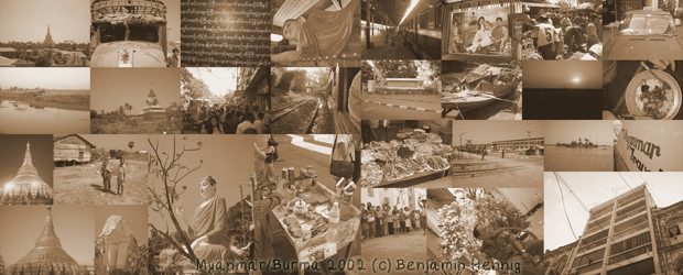
Burma, or officially Myanmar, gains the world’s attention mainly with some sort of bad news in recent years: The suppression of the Saffron Revolution in 2007 and the natural disaster of Cyclone Nargis in 2008 are the most prominent events that brought the country back in people’s minds. Apart from that, few of us now much more about the country, which is ruled by a military regime since 1962.
Now it is back on the news agenda, as the first elections since 1990 have been announced to take place today. The 1990 result has been ignored by the ruling junta and Aung San Suu Kyi the leader of the then-winning party NLD has been under house arrest most of the time since 1989. Many wonder what impact this year’s election will have – if any at all. Apart from all the political implications, the perhaps most significant implication of this election – regardless of the outcome – is the fact that “We must keep telling Burma’s story“. Few genuine stories cross the borders, and there are little insights to the life under military oppression available, such as the footage of Burma Soldier which has recently been shown at Sheffield Doc/Fest.
Telling Burmas story does include learning about the country’s geography. As this website is all about maps and visualisation, this can be shown with a map to visualise the basic geography of Burma (drawing a map of the election may be less useful given the doubtful nature of these election and the general lack of reliable data). The following map shows a conventional physical map of Burma (with selected cities labelled) compared to a gridded population cartogram that visualises the population distribution. The population map shows the importance of the Irrawaddy delta region which is the most densely populated area of Burma. This explains the impact that cyclone Nargis had in this area that is situated only few metres above sea level. Yangon (or Rangoon) with a population of approximately 5 million lies on the Eastern edge of the delta region. It had also been Burma’s capital until 2006, when the military government decided to move the capital away from the main population to a less populated region but strategically well situated between Yangon and Mandalay. As a result, Naypyidaw was announced the new capital in March 2006. The last royal capital Mandalay, Burma’s second largest city, is the centre of the economically important region of upper Burma which is heavily influenced by trading links to China’s Yunnan province. Much less populated are the mountainous regions in the North of the country. Here are the maps:
