The Real World at Night

The night view of the earth has become a very popular depiction of this planet. Although the NASA itself says that “The brightest areas of the Earth are the most urbanized, but not necessarily the most populated” many people mistake this view as a representation of the inhabited places on the globe. Our gridded population cartogram can help to get a better understanding of the relation of people and light. The following map is a reprojection of the earth at night that shows the nightview in relation to the population distribution. The gridlines are kept in a light colour and thus allow to identify those areas where the lines converge (representing the unpopulated regions). In contrast, the populated areas are given the most space, so that one can easily see which populated areas are literally illuminated at night – and where there are people living in darkness. The resulting map is an impressive picture of an unequal world, with large parts of Africa living in darkness, and the affluent countries in Europe and North America glowing in the dark:

The Earth at Night projected on a gridded population cartogram(click for large image)
See here for an updated and more detailed version of this map

Continue reading

A population-centric map projection

Here is some material from a presentation at this year’s  AAG Annual Conference in Washington DC. The presentation People powered maps: A population-centric map projection was given in the session on Topics in GIS, Remote Sensing, and Spatial Analysis and showed some new works on our grid-based cartograms (as presented at GISRUK 2009 and ESRI UC 2009).
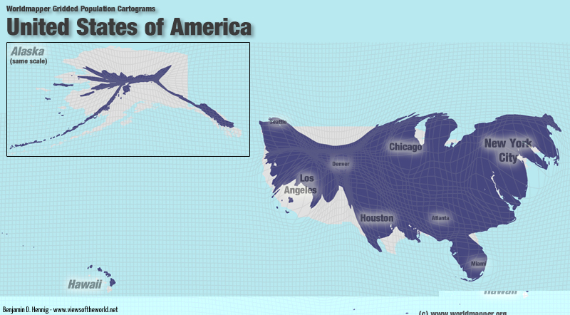
The following animation shows the transformation of a topographic map of the United States, ending in a grid-based population cartogram (and then reversing). Please notice that loading the animation takes a while on slower internet connections:

USA Animated Population Cartogram with Topography
(click for larger view)

This is the full presentation given at the AAG Meeting. Please note that the animated parts such as the above animation are not shown in this Slideshare version:

The content on this page has been created by Benjamin Hennig. Please contact me for further details on the terms of use.

ArcUser article: Re-Mapping the World’s Population

My contribution to the ESRI UC 2009 found its way into the Winter 2010 edition of ArcUser:

  • Hennig, B.D., Pritchard, J., Ramsden, M., and Dorling, D. (2010). Remapping the World’s Population. Visualizing data using cartograms. ArcUser 2010 (1), 66-69.
    pdf icon Article as PDF ; Article online
  • The slideshow from last year’s talk at the ESRI UC Is now also available online to watch on Slideshare:

    The content on this page has been created by Benjamin Hennig. Please contact me for further details on the terms of use.

    The United Kingdom within the world’s demographic change

    Population growth in Britain? Decline in Europe? Where does the UK stand, and what implications does this have for politics? A population crash and an ageing population require political action. This slides by Danny Dorling and me, presented at the Royal Commission on Environmental Pollution, provides an insight into the current trends:

    Update February 2011: Read more about the release of the Royal Comission’s final report on Demographic Change and the Environment (for which this presentation was prepared for)

    The content on this page has been created by Benjamin Hennig. Please contact me for further details on the terms of use.

    Geovisualisation of flows

    Geovisualisation of flowsThis is some material from my first year of PhD-research in the Worldmapper project (funded by the Leverhulme Trust):
    “Geovisualisation of flows: Finding new approaches to map an interdependent world” – Poster display at the RGS Annual Conference in Manchester, 26-28 August 2009
    pdf icon Download poster as PDF

    Slides of my postgraduate presentation at the Department of Geography, University of Sheffield, 26 May 2009 (also accessible on Slideshare):

    The content on this page has been created by Benjamin Hennig. Please contact me for further details on the terms of use.

    Re-Mapping the World’s Population

    “Re-Mapping the World’s Population” – Presentation at the ESRI International User Conference in San Diego, 13-17 July 2009

    Abstract:
    The Worldmapper project has successfully produced a series of maps to visualize data, concerning a range of issues facing the modern world, based upon the idea of density-equalising maps. The Cartogram Geoprocessing Tool incorporating this density-equalising method has also recently been made available for ArcGIS. This presentation introduces and evaluates further new mapping approaches that move depictions beyond their simple descriptive form. It gives an insight into these new developments, focusing on sub-national level data which has until now been neglected. The world population cartogram demonstrates the first attempt to include sub-national density data. Within this approach, ArcGIS 9.3 plays a crucial role as an interface to convert suitable raster datasets and to produce updated cartograms. The data is converted using ArcMap’s Toolbox, while the Cartograms, due to their large size were, calculated in a Unix environment. The final visualization has been conducted in ArcMap.

    pdf icon Download paper as PDF

    (published 2009 in the ESRI User Conference Proceedings)

    USA Population Cartogram

    These are the slides from my talk:

    The content on this page has been created by Benjamin Hennig. Please contact me for further details on the terms of use.