
Changing times was the title of a session at this year’s Annual Symposium of the British Cartographic Society (not to be confused with the Society of Cartographers which will have its annual conference in September).
My contribution as a speaker in this session was titled Changing views of a changing planet. In the presentation I took a look at how changes in data and technology can provide alternative ways of mapping a globalised world, and mapping cities as the hotspots of globalisation. Continue reading
Category Archives: conferences
Mercator revisited
The 5th of March 2012 marks the 500th birthday of Gerardus Mercator, the creator of the world map that profoundly changed our views of the world. He was not the only one who worked on a conformal map projection in the 16th century, which was still an age of exploration and discovery. But he was the first to do the maths right and complete a world map that allowed ships to navigate around the planet by its ability to represent lines of constant course. That makes the Mercator projection a milestone in the history of cartography and remains one of the central map projections up to the present day. Continue reading
New York City: Mapping the melting pot
 New York is the host city to this year’s AAG Annual Meeting. For my plenary presentation at the Population Specialty Group session I therefore decided to add a little bit of a local touch to the talk by including a new map of New York City in the slides. Continue reading
Where does it always rain on us?

Does it never rain in Southern California? And can we find the rain in Spain mainly in the plain? And what does that all mean for the people living in these places? Where does rain matter most for the population? In some places, it can be a much needed scarcity, elsewhere it appears in a much dreaded surplus. Wherever it is falling, rain matters a lot where people are. Partly, the global population distribution can be explained by climate patterns, with rain being a crucial factor for the agriculture in a region. In my presentation for the delegate’s session at this year’s 47th annual meeting of the British Society of Cartographers in Plymouth I took a closer look at the weather, or to be more precise, at climate patterns and their visualisation using gridded cartograms. Part of the presentation was an animation showing the global precipitation patterns projected on a gridded population cartogram. The following map shows the annual precipitation in relation to the global population distribution. The small map inset gives the conventional view of the same data, demonstrating how the perspective changes when seeing the same topic from two different views: Continue reading
Visualisations of a World in Crisis

Gridded Cartograms and the World Population Atlas
For this year’s 46th Annual Summer School of the Society of Cartographers I recalled the making of the World Population Atlas and wrapped all material up for some contributions for the meeting. The outcome are two new posters and a presentation for the delegate’s session:
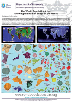 Poster: The World Population Atlas |
 Poster: Creating Gridded Cartograms |
The content on this page has been created by Benjamin Hennig. Please contact me for further details on the terms of use.