
The mental map of the world though the eyes of Guardian Online readers in recent years may look a little bit like the following cartogram adding up the distribution of all online news items in the period of 2010 to 2012 (excluding the coverage of domestic British news):

The picture confirms very much the hotspots of political, economic and in smaller proportions also natural events at the start of the new decade that we are now well into. Following the map series of Guardian Online news coverage in recent years, the following maps demonstrate a different approach to how change can be mapped in cartogram form. Rather than using the absolute values for a topic, when having a time series one can also look at the change between individual moments in time. So when wanting to see how the global news coverage of the Guardian website has changed between 2011 and 2012 one gets two sets of data, one indicating the absolute increase and one indicating the absolute decline in news items in that time. This is what the following two maps show, demonstrating which regions suddenly appeared or became more important in the media, and where the relevance and public attention dropped (while a stagnating news coverage – regardless of it being very high or very low – is not reflected in this approach and better shown in the absolute mappings that were shown in the first part of this data analysis):
Increase in Guardian Online News Coverage between 2011 and 2012
(excluding the United Kingdom)

(click for larger version)
Decline in Guardian Online News Coverage between 2011 and 2012
(excluding the United Kingdom)

(click for larger version)
To highlight just some of the emerging patters: As the maps show, tensions on the Korean Peninsula rose last year (also putting South Korean matters more into the spotlight), Spain became a bigger story in the Eurozone Crisis, and Ecuador went into the focus with row over Julian Assange. The uprising in the Arab World shifted to Syria, and a year after Fukushima Japan went into a (news-)decline again, after it gained quite an increase in the previous period between 2010 and 2011. Quite interestingly some of the major patterns in the increase of news items between 2010 and 2011 are reflected in the above shown patterns in the decline of news the year after. Here are the changes for the previous period:
Increase in Guardian Online News Coverage between 2010 and 2011
(excluding the United Kingdom)

(click for larger version)
Decline in Guardian Online News Coverage between 2011 and 2012
(excluding the United Kingdom)

(click for larger version)
While our society has become very addicted to ever changing and ever more news in recent years, news itself is a quite interesting topic to look at and to speak about. Will there ever be a 1930 BBC News moment again?
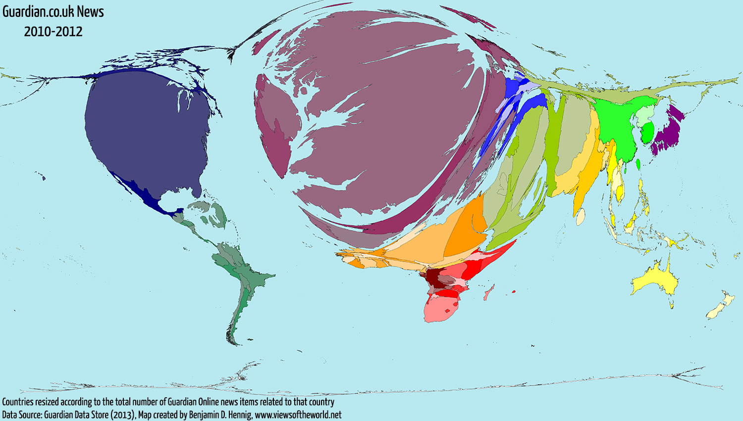
Finally, to conclude this little series on how the British view the world (when it comes to the Guardian Online edition), here is the map that shows the total data that I was working with adding up all geographically tagged news items from the Guardian website in the period of 2010 to 2012 including the stories about the United Kingdom:
The content on this page has been created by Benjamin D. Hennig using data from the Guardian Data Blog team. Please contact me for further details on the terms of use.