You might have been wondering why there are so few new cartograms appearing on this blog. Continue reading
Tag Archives: news
Have I got news for you
You may have noticed a slowdown in updates here on my website. I have been putting a lot of effort into the new Worldmapper website in recent months (check it out, it also has its own cartogram blog). Since Views of the World as well as Worldmapper are spare time projects and not my ‘real’ work, this website here gets a bit less attention, though I have not entirely abandoned it. Make sure to visit again, I will most definitely continue to post updates here as well that don’t fit in what we are doing over on Worldmapper. And also visit Worldmapper, we have a lot of exciting things lined up there!
All the latest stuff that I am up to can also be followed on Twitter: @geoviews
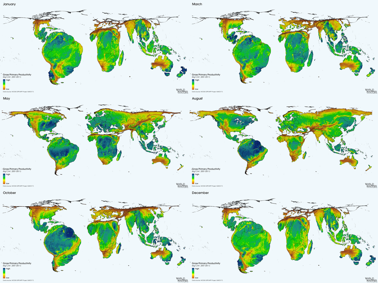
P.S.: Just so that you know what stuff in going on at Worldmapper, here is a recent map showing the heartbeat of nature (as produced by the terrestrial biosphere).
Changing Views of the World
The mental map of the world though the eyes of Guardian Online readers in recent years may look a little bit like the following cartogram adding up the distribution of all online news items in the period of 2010 to 2012 (excluding the coverage of domestic British news):
The picture confirms very much the hotspots of political, economic and in smaller proportions also natural events at the start of the new decade that we are now well into. Following the map series of Guardian Online news coverage in recent years, the following maps demonstrate a different approach to how change can be mapped in cartogram form. Rather than using the absolute values for a topic, when having a time series one can also look at the change between individual moments in time. So when wanting to see how the global news coverage of the Guardian website has changed between 2011 and 2012 one gets two sets of data, one indicating the absolute increase and one indicating the absolute decline in news items in that time. This is what the following two maps show, demonstrating which regions suddenly appeared or became more important in the media, and where the relevance and public attention dropped (while a stagnating news coverage – regardless of it being very high or very low – is not reflected in this approach and better shown in the absolute mappings that were shown in the first part of this data analysis):
Increase in Guardian Online News Coverage between 2011 and 2012
(excluding the United Kingdom)

(click for larger version)
Decline in Guardian Online News Coverage between 2011 and 2012
(excluding the United Kingdom)

(click for larger version)
Everything’s Changing: A World of News
This is a map series visualising a comprehensive data set kindly provided to me on request by the editors of the Guardian Data Blog a couple of months ago (special thanks to Peter Martin and Grant Klopper for this!). The work on these maps started with the idea to make an update of the still quite frequently accessed maps of global news coverage of the Guardian.co.uk news website that I created for the years 2010 and 2011. As explained back then, while being the snapshot of one single newspaper this data also gives some indications of the way the countries of the world are represented in the print media in the United Kingdom, hence giving a picture of how the world looks through the eyes of the British people (it’ll vary slightly for other media outlets, though the overall picture will result in similar patterns).
I have now updated this map using the most recent data that the data store team sent to me (unfortunately it is not available in the data store this time). The data lists the total number of news items on the website of the British Newspaper The Guardian that are tagged with a specific country name. For the year 2012 the news coverage (leaving out the United Kingdom) on their website was distributed as shown in this cartogram:
With the United States being consistently the second largest country represented in the data (after the UK which is excluded in this map) it should be mentioned that this may not only be explained with a certainly quite prevalent US-biased media coverage in most of the British press, but could in the case of the Guardian also be explained with the additional fact that the Guardian is expanding its media activities more and more actively across the Atlantic (also launching a dedicated online US edition in 2011), and indeed worldwide, as the very recent move to the domain http://www.theguardian.com/ suggests.
With having a series of three years (ranging from 2010 to 2012) available, I was now able not only to look at an update to the previous maps, but could also start a little look into the changing patterns that emerge from the data. The following animation shows how the news coverage has shifted in this period:
A New Image of the World
British News of the World 2011
According to the British Guardian, 2011 was the year of the news overload, with many people perceiving the year’s news from around the world being extremely significant in manifold ways. “There is no news“, as reportedly broadcast by the BBC an a day in 1930, is an unlikely in our media age, but whether last year’s news were more significant than usual remains another question. It may just as well be a proof of an increasingly connected world where news become ever more instant and people demand new news virtually every second – the news overload of 2011 may therefore also be a result of the overload of news produced by the media (and demanded by the population). Continue reading


