A question often asked about Worldmapper is in regard to our choice of colours for the different regions and countries. On the website we briefly explain that the colours used on the maps group the territories into 12 geographical regions, and allow for an easier visual comparison between the maps than would otherwise be possible. The shading of each territory within a region is consistent throughout all of the maps.” But there is a little bit more to the colours which tell a story about the unequal fortunes of the world which follow a general pattern along the major regions.
The colours of the world’s regions are chosen very consciously, and have a deeper sense behind their distribution. We split the world into twelve contiguous geographical regions of population groups, with every region being roughly symmetrically balanced and having at least a population of one hundred million people. This is how the world’s population is distributed:
 Continue reading
Tag Archives: cartogram
Megacity London: ever growing, ever more unequal?
What is it about London? Population growth is slowing across most of Europe – people are having fewer children and, it could be argued, steps are being taken to try to reduce social inequalities. But London is unusual. London continues growing, and London is becoming more youthful. The middle aged and those who are poor, but not desperately poor, are being squeezed out. Graduates from the rest of Britain and the rest of the world flow in ever greater numbers and require ever higher degrees of optimism. Many fail to achieve their aspirations. Above them a few are becoming ever richer. Below them, as private rents and social housing becomes too expensive for huge numbers of lowly paid families and many leave, a new poor may be growing, less well documented, less well protected, with even less to lose.
With a population of currently 8.2 million (according to the 2011 Census), London is not only unique for one of the old world’s megacities by being projected to continue rising significantly in population size over the forthcoming decades, but also by its specific demographic structure. Like many large cities, London has a large share of people in the younger age groups – over 20% in the cohorts from 25-34 – but also a significant share of the youngest with around 7% of its population being 0 to 4 years old. Here is a population pyramid of London compiled from the 2011 Census data that has been released recently: Continue reading
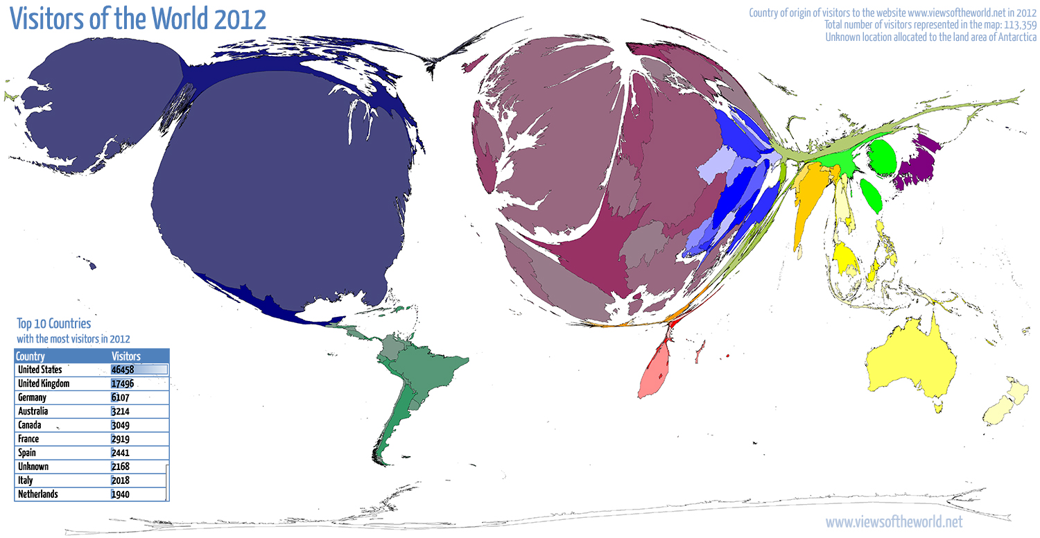
Visitors of the World 2012
2012 has been a quite busy year on this website with the number of annual visitors breaking the 100,000 mark for the first time. The analytics tool Piwik which I use for monitoring my website counted precisely 113,359 visits in 2012, up from almost 90,000 the year before. So thanks everyone for visiting either once (as 85,000 people did) or as one of the 16,800 more regular visitors. This asks for a new map that’s showing, where each of the counted visits came from last year: 176 individual countries were counted, as well as a larger number of unknown origins (and of course all those who prefer blocking any analytics tool, they do not appear in any of these statistics). Despite such a large diversity of visits from around the world, the majority comes from places that one may expect, given certain characteristics of this website (language, location, etc.), and also given the accessibility of the internet, which until today remains a very unequal story, even if availability of the online world slowly finds its way to the less privileged places on this planet. But I digress, so here is the map of all visits to viewsoftheworld.net in 2012:
In Focus: Mapping Britain’s Super-rich
 George Osborne’s autumn statement on the government’s budget rekindled the ongoing debate about the fairness of the coalition’s spending cuts. How does it look like if you take a look at the richest and the poorest parts of society? In an article for the “In Focus” section of Political Insight (December 2012, Volume 3, Issue 3) Danny Dorling and I plotted the geography of the wealthiest of the wealthy in the United Kingdom in comparison to poverty.
The map that I created for this feature displays the distribution of the top 1% of the wealthiest 1% according to information published by the agency WealthInsight, one of the companies trying to gather information on this part of the publication that is a prime target for exclusive marketing. Displayed in the map are data on people with assets in excess of US$30 million and where they have their prime address registered in the UK. The extent of the data is very limited because WealthInsight releases data for only 20 UK cities and regions based on postcode areas (Northern Ireland is a single postcode area which is why we did not correlate that data with Belfast’s overall population). Here we have superimposed that data on a population cartogram of the country, drawing circles with an area in proportion to the numbers of super-rich (in red) over people living in each city (in blue). Where they overlap, the circles turn into a purple colour. Where there are more super-rich people than population alone would predict, there is an orange ring around a purple core, as shown around London. Where there are fewer super-rich than the population of a city might predict, there is a blue outer-ring, as around Birmingham. The underlying map shows the distribution of poverty in the UK in five shades of grey.
Cities such as Leeds, Birmingham and Nottingham have fewer super-rich than might be expected – partly because they are not especially affluent urban centres but also, most probably, because their postcode does not include nearby areas such as the North Yorkshire stockbroker belt or the Cotswolds. Aberdeen, in contrast, has some multimillionaires: beneficiaries of the oil boom with an Aberdeen postcode who live some distance from that city. With Manchester it is hard not to speculate that a few extra footballers may have tipped it over the limit.

A World Map of Organic Agriculture
Organic agriculture is a production system that sustains the health of soils, ecosystems and people. It relies on ecological processes, biodiversity and cycles adapted to local conditions, rather than the use of inputs with adverse effects. Organic agriculture combines tradition, innovation and science to benefit the shared environment and promote fair relationships and a good quality of life for all involved. (IFOAM 2009)
The practice of organic farming is not only relevant for soothing the bad conscience of wealthier societies, but it plays an important role in preserving croplands from degradation that is often caused by conventional intensive methods of farming. The Food and Agriculture Organization of the United Nations (FAO) recognised this need and set up the Organic Agriculture Programme. Its objective is “to enhance food security, rural development,sustainable livelihoods and environmental integrity by building capacities of member countries in organic production, processing, certification and marketing“. With a still growing world population and the rising demand for food, more sensible (and thus sustainable) ways of agriculture are needed more than ever to stop damage to the world’s arable lands.
In a joint paper published last year in the European Journal of Social Sciences (Vol. 24, Issue 3) John Paull and I presented a new world map of organic agriculture that presents countries as proportional in size to their share of the total of world organic hectares (data sources are described in the paper, reference see below):

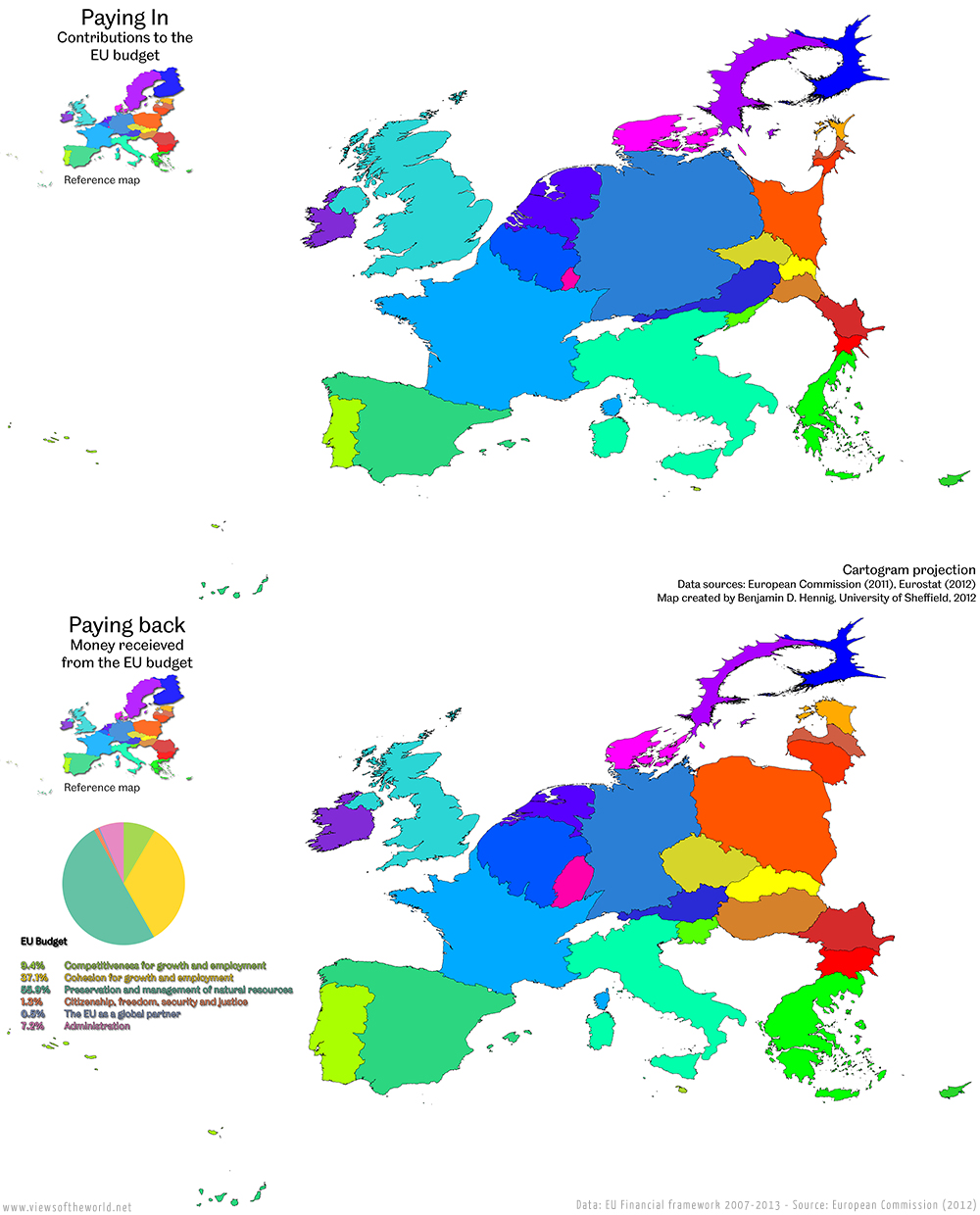
Visualising the EU Budget
Last week’s map series on the financial state of the European Union focused on a general overview of how population and economic activity relate to the financial framework of the Union. The current financial framework covers the period of 2007-2013 and ensures a certain planning security for the main areas of the common political goals of the EU. With the current framework expiring next year, tense negotiations are under way for the forthcoming Multiannual financial framework 2014-2020. The outcome will undoubtedly have major implications on the functioning of the European Union, as the budget allows key political areas to be pursued beyond national politics: “The Multiannual Financial Framework (MFF) defines the EU’s long-term spending priorities in line with the agreed political priorities and sets annual maximum amounts to be spent on each priority. The financial framework stretches over several years […] to ensure sound and responsible financial planning and management.”
The following map series shows the current funding priorities of the EU budget. It shows that beyond the net benefits and contributions, large proportions of the money are actually redistributed between the wealthiest member states. The first two maps compares how much is paid into and received from the EU budget by each member state at the moment: