
 With Lonesome George an international icon for conservation has died (although there are still chances that his subspecies of the Pinta Island tortoise (Chelonoidis abingdoni) will continue to exist). The extinction rate of endangered species however remains high and some say may even be the Earth’s sixth mass extinction. Less controversially it can be stated that the current extinction rates are higher than one would expect without humankind’s influence, and that more action to preserve the environment is needed. Continue reading
A year of crises: Global refugee trends
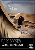 “A report released by the UN High Commissioner for Refugees shows 2011 to have been a record year for forced displacement across borders, with more people becoming refugees than at any time since 2000. UNHCR’s ‘Global Trends 2011’ report details for the first time the extent of forced displacement from a string of major humanitarian crises that began in late 2010 in Côte d’Ivoire, and was quickly followed by others in Libya, Somalia, Sudan and elsewhere. In all, 4.3 million people were newly displaced, with a full 800,000 of these fleeing their countries and becoming refugees.” (Quoted from the UNHCR Press Release)
In the Worldmapper project we have mapped refugees before (see the maps of refugee origins and destinations) but these maps are far more outdated than most material that we have on Worldmapper. Not only provides the new report a comprehensive updated series of data, but also are refugee numbers of an extremely changing nature as they do not follow general mid- or long-term trends (such as changes in population or carbon emissions). As the introductory statement indicates, humanitarian crises and other hardly predictable events can result in changing refugee patterns.
The following two maps show the updated picture of refugee trends in 2011 as published in the UNHCR report this week (which also saw the commemoration of World Refugee Day “dedicated to raising awareness of the situation of refugees throughout the world“. The two maps use the total numbers for ‘refugees and people in refugee-like situations’ according to their country of origin and destination. Excluded in these maps are those refugees whose origin is unknown or who are stateless:

Mapping the global village
Changing times was the title of a session at this year’s Annual Symposium of the British Cartographic Society (not to be confused with the Society of Cartographers which will have its annual conference in September).
My contribution as a speaker in this session was titled Changing views of a changing planet. In the presentation I took a look at how changes in data and technology can provide alternative ways of mapping a globalised world, and mapping cities as the hotspots of globalisation. Continue reading
The Human Shape of Britain
The British monarchy is celebrating the 60-year reign of Queen Elizabeth II as the official head of state of the United Kingdom. The British Monarchy reaches beyond the boarders of the United Kingdom, making the Queen a constitutional monarch of (currently) 16 countries of the 54 members of the Commonwealth. Celebrations of the Diamond Jubilee will therefore not only be a matter of British subjects, a term which adds to the sometimes confusing geographical realities related to Britain. The epicentre of the events is of course the United Kingdom, especially the capital city London where the celebrations peak this (extended) weekend. The media is well prepared to get the global attention aligned to London ahead of the Olympics. In ongoing difficult economic times these upcoming events are a welcoming distraction for politicians to keep the population quiet.
To put the people back at the centre, here comes a new look at the population of the United Kingdom. The following map builds on the gridded population cartogram that I published on this website before (e.g. at this comparison of a choropleth density map and a cartogram, in this report of the Royal Commission, at this comparison of the different parts of the UK, or in this first London feature on this website). The new gridded population cartogram is a revised version using a much higher resolution population grid like in this population map of Germany. The data comes from the LandScan database which allows to map even more detail in the population distribution, which is why this new map shows a higher variation of population densities within the most densely populated areas. The map is the most detailed gridded population cartogram of the United Kingdom produced so far, which allows us to see even smaller cities in their population context. The map is an equal population projection where each grid cell is resized according to the number of people living there. It shows human shape of the United Kingdom in HD resolution as never before:

Inequalities in Immunisation
 Global inequalities in health find their expression in a wide range of issues that start in the very early ages of a person’s life. Children are most at risk, as health-related problems can have implications on the rest of their life – if they survive childhood at all. Finding the Final Fifth: Inequalities in Immunisation is the title of a new report published by Save the Children in partnership with ACTION and endorsed by the World Health Organisation.
The report takes a closer look at health inequalities related to immunisation coverage. With children being highly vulnerable, no access to immunisation is one of the preventable causes of death. Further efforts such as the Global Vaccine Action Plan (pdf) are needed to tackle the problem. “Reaching the hard-to-reach must be a priority for all countries“, concludes Save the Children in a statement prior to the 65th World Health Assembly where these issues were on the agenda.
The Worldmapper project contributed a cartogram series to the report, looking at some of the data that Save the Children used in its findings. The data shows how access to health and immunisation compares to mortality rates of children and how this data gives an indication of the prevailing global inequalities. We created four maps, of which three were included in the report (the following maps are modified version of these maps). All of the maps show the countries resized according to the total number of people for each topic that is visualised (i.e. these images work like a cartographic version of a pie chart). The original data sources are given in the report (download link see below). The first map shows the mortality of under-five year old children:

London’s Vote 2012
The old Mayor is the new Mayor of London as Boris Johnson secured a second term in office at this month’s election in the British capital. This left contender Ken Livingstone in second place at a campaign that was put the two personalities more into the spotlight than the underlying politics. Beyond the decision between Boris and Ken the elections provided an insight into how much the political patterns have changed since the last election in 2008. As a comparison to the feature published before the election, I created the same map series from the 2012 election results, giving an updated view of the political landscapes of London of all contestants and their respective political parties. This year’s election saw fewer candidates and resulted in a more polarised picture between the two main parties (Conservative and Labour) and the smaller ones. Nevertheless, the individual vote distributions of all participating parties (and candidates) result in specific patterns that correspond to the preferences of the population in London. Majorities of votes from each part of the political spectrum – from right to left wing views – are significantly distributed, not only when it comes to differences between Labour- and Conservative strongholds, but also for the smaller parties, as the following map series demonstrates by mapping the individual vote shares accordingly. The results are displayed on a gridded population cartogram of London (election data provided by London Elects):
