Global Water Insecurity

Global threats to human water security and river biodiversity is the title of a new study that points out that almost 80% of the world’s population are exposed to some risk of insecure freshwater resources (published in Nature 467, 555-561 (30 September 2010) | doi:10.1038/nature09440). The researchers created a global raster plotting the security level of water resources based on an index of water threats which is discussed in their paper.
Much of the threats in wealthier countries can be counteracted with technology, which explains much less actual insecurity in these countries – but therefore puts biodiversity at risk and resulting in a high price for an inevitable resource of human life.
Talking to BBC News Peter McIntyre from the University of Wisconsin, one of the scientists involved in the study, puts it this way:

“But even in rich parts of the world, it’s not a sensible way to proceed. We could continue to build more dams and exploit deeper and deeper aquifers; but even if you can afford it, it’s not a cost-effective way of doing things.” (Source: BBC)

The unaltered stress level of global freshwater resources as published in the study is presented in this map (Source: Nature):
Global geography of incident threat to human water security and biodiversity / Source: Nature
Accompanied by the map of biodiversity, this gives an interesting insight to the impacts on biodiversity. The impact on human population remains less shown in this depiction but is another crucial issue of the paper. As mentioned before, 80% of the world population are exposed to threatened water resources. By applying their map to the gridded-cartogram technique, the whole impact of these threatened water resources on the population becomes apparent. The 80% at risk become visible, as the map transformation preserves the geographical reference of the underlying grid. The emerging picture is going along quite well with the findings of the study and thus adds another interesting perspective on the issue of threatened water resources in the most populated regions in the world. All data from the study is available on http://www.riverthreat.net/data.html and we used that data to reproject the key maps of the study.
This map shows the “natural” picture of the human water security threat level from the study:

Map of Global Water Insecurity
(click for larger version)

When taking the investments on water technology into account, this picture changes considerably, as the next map shows:

Continue reading

Gridded Cartograms and the World Population Atlas

For this year’s 46th Annual Summer School of the Society of Cartographers I recalled the making of the World Population Atlas and wrapped all material up for some contributions for the meeting. The outcome are two new posters and a presentation for the delegate’s session:

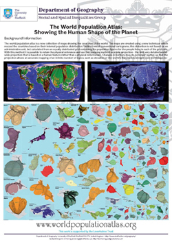
The World Population Atlas: Showing the Human Shape of the Planet
Poster: The World Population Atlas
Poster: Gridded Population Cartograms: Drawing the Human Shape of the Planet
Poster: Creating Gridded Cartograms

The content on this page has been created by Benjamin Hennig. Please contact me for further details on the terms of use.

Magnificent Maps: Changing Perspectives

Magnificent Maps: Power, Propaganda and Art is an exhibition showing “80 of the largest, most impressive and beautiful maps ever made, from 200 AD to the present day”. The free exhibition still goes until 19 September 2010 at the The British Library in London.

The following map has been shown by Danny Dorling in one of the accompanying events. The lecture Changing perspectives: mapping global injustice by changing the view? introduced a series of maps using the gridded cartogram technique, some of which were shown to a wider audience for the first time. This map is a reprojection of the world according to the population distribution based on an equally distributed grid. The grid size in this map equals a 0.25° raster on a conventional map and a composite satellite raster image of the world has been transformed accordingly, so that the map reflects the population distribution in relation to the landscapes on which people are living:

Composite satellite image projected on a gridded world population cartogram
(click for larger view)

Continue reading

A brief look at map projections

Featured

Each and every map represents a distorted view of reality. Therefore, cartograms are not as unusual as they might appear at a first glance. Map projections are a central aspect of the Worldmapper project because the maps (respectively cartograms) featured in the project are basically not different from some sort of re-projection of the world, albeit in a different way than conventional projections used in cartography. Rather than trying to solve the conflicts of distortion when drawing a three dimensional surface on to a two dimensional area (be it a screen or a paper map), the worldmapper cartograms distort our image of the world on purpose and show each country in proportion to a specific topic. This is reason enough to reflect a little bit on what map projections are and in what way they create a distorted view of the world.

Worldmapper map using different projections

Continue reading

Money

Financial meltdown, recovery, inequality, injustice. Doom and gloom everywhere. But the world has been a strange place before, and it is very much about money. The following music video assembles a showcase of worldmapper maps to the lyrics and music of Money, a song by N.A.S.A. feat. David Byrne, Chuck D, Ras Congo, Seu Jorge & Z-Trip:

Money – Worldmapper Edition

There is a HD version available on YouTube, where you can also access the full accompanying lyrics as subtitles.

The content on this page has been created by Benjamin Hennig. Please contact me for further details on the terms of use.

2010 Worldcup goals map

Red and yellow dominated the final match of the worldcup with a remarkable 14 cards in these colours shown in the 120 minutes, and red-yellow eventually also taking the trophy, just as Paul predicted. One goal was enough for Spain, demonstrating once again their efficiency: Spain scored 8 of the tournament’s 145 goals in their seven matches to the title. The following map shows, how the nations compare in terms of goals – from Germany’s 16 (with Thomas Müller taking the Golden Boot) to Algeria’s. The second maps in contrast shows all goals conceded, from North Korea’s unfortunate 12 to Portugal and Switzerland’s 1:

All 2010 Worldcup goals on a map(click map for a larger view)

Continue reading