

Cartograma cuadriculada de la población de Ecuador
The people of Ecuador are going to the polls today, voting at the first general election after the constitutional court resolved the Democracy Code in 2012. This comes at an interesting time from a British perspective, as WikiLeaks founder Julian Assange still calls London’s Ecuadorian embassy his home. Ecuadorians may care little about this international diplomacy row, and some may be more interested in issues regarding press freedom in their home country. But after many years of economic uncertainty and political instability following the collapse of the banking system in 1999, many other questions will rate far more important at these elections in a country that is extremely diverse for its size, not only in its nature, but also its population.
“Ecuador is a patchwork of indigenous communities, including people of colonial Spanish origins and the descendants of African slaves” (quoted from the BBC Country Profile Ecuador). For a country of only 283,561 sq km size (slightly smaller than Nevada, as the CIA World Factbook puts it), Ecuador has a remarkably diverse natural environment: The continental area stretches from the tropical rainforests in the east over the Andean highlands to the low lying coastal zone. And 1,000 km westwards off the coast the Galapagos Islands form the volcanic outpost of the country.
The population of over 15 million people is concentrated in two of these four major regions: ‘La Costa’ – the coastal region – is home to Ecuador’s largest city Guayaquil (2.3 million people), while the capital Quito (1.6 million people) is located in ‘La Sierra’ – the highlands at an elevation of over 2,800 m above sea level). Despite their high altitude, the Ecuadorian part of the Andes is home to a considerable population almost equal to the coastal areas. The less accessible rainforest region as well as the the Galapagos Islands in contrast are home to only small numbers of people.
The distribution of Ecuadors population is visualised in the following gridded population cartogram (a ‘cartograma cuadriculada de la población ‘ in Spanish), which is a much improved display compared to the original version of this map that I created in 2009 for the World Population Atlas. The improved resolution is made possible by using the LandScan population data which in this case provides a better estimate for the real distribution of people than the SEDAC GPWv3 data. The map shows an equal-sized grid over the land area of Ecuador resized according to the total number of people living in each of the grid cells, so that larger grid cells reflect higher numbers of people, while depopulated areas almost disappear from the map.
The green to brown colours in the map reflect the altitude of the areas, so that the coastal and mountainous regions are clearly distinguishable. The transitional zones of intermediate shadings (and elevations) almost disappear from this map, which shows the relatively small numbers of people living where relief gradients are steepest. The rainforest region (La Amazonía, or also El Oriente as it is situated in the east) which makes almost half of the land area, is equally underrepresented in this map, as it is home to less than 5% of the population. This is the human shape of Ecuador:

The Worldmapper Rainbow
A question often asked about Worldmapper is in regard to our choice of colours for the different regions and countries. On the website we briefly explain that the colours used on the maps group the territories into 12 geographical regions, and allow for an easier visual comparison between the maps than would otherwise be possible. The shading of each territory within a region is consistent throughout all of the maps.” But there is a little bit more to the colours which tell a story about the unequal fortunes of the world which follow a general pattern along the major regions.
The colours of the world’s regions are chosen very consciously, and have a deeper sense behind their distribution. We split the world into twelve contiguous geographical regions of population groups, with every region being roughly symmetrically balanced and having at least a population of one hundred million people. This is how the world’s population is distributed:
 Continue reading
Megacity London: ever growing, ever more unequal?
What is it about London? Population growth is slowing across most of Europe – people are having fewer children and, it could be argued, steps are being taken to try to reduce social inequalities. But London is unusual. London continues growing, and London is becoming more youthful. The middle aged and those who are poor, but not desperately poor, are being squeezed out. Graduates from the rest of Britain and the rest of the world flow in ever greater numbers and require ever higher degrees of optimism. Many fail to achieve their aspirations. Above them a few are becoming ever richer. Below them, as private rents and social housing becomes too expensive for huge numbers of lowly paid families and many leave, a new poor may be growing, less well documented, less well protected, with even less to lose.
With a population of currently 8.2 million (according to the 2011 Census), London is not only unique for one of the old world’s megacities by being projected to continue rising significantly in population size over the forthcoming decades, but also by its specific demographic structure. Like many large cities, London has a large share of people in the younger age groups – over 20% in the cohorts from 25-34 – but also a significant share of the youngest with around 7% of its population being 0 to 4 years old. Here is a population pyramid of London compiled from the 2011 Census data that has been released recently: Continue reading
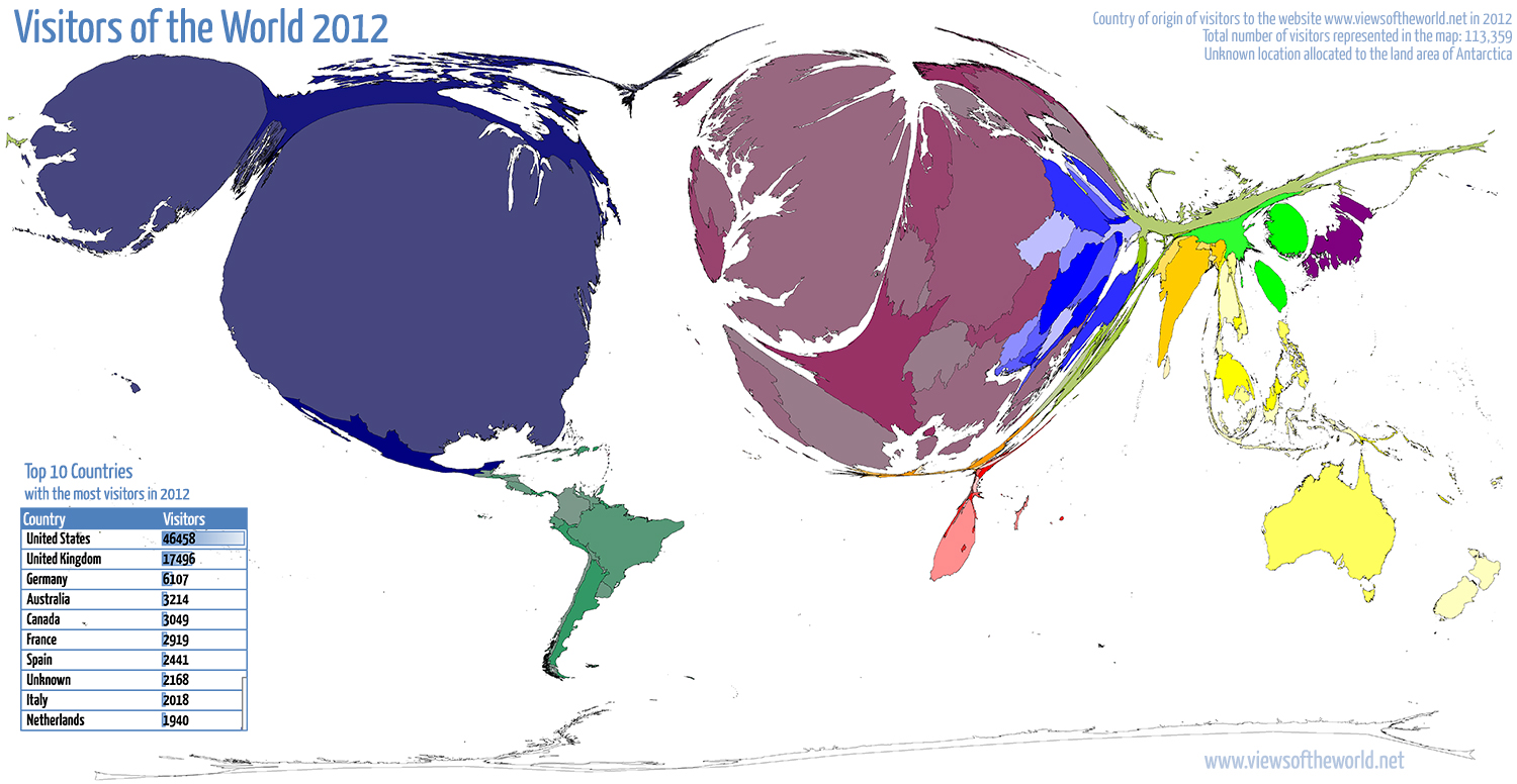
Visitors of the World 2012
2012 has been a quite busy year on this website with the number of annual visitors breaking the 100,000 mark for the first time. The analytics tool Piwik which I use for monitoring my website counted precisely 113,359 visits in 2012, up from almost 90,000 the year before. So thanks everyone for visiting either once (as 85,000 people did) or as one of the 16,800 more regular visitors. This asks for a new map that’s showing, where each of the counted visits came from last year: 176 individual countries were counted, as well as a larger number of unknown origins (and of course all those who prefer blocking any analytics tool, they do not appear in any of these statistics). Despite such a large diversity of visits from around the world, the majority comes from places that one may expect, given certain characteristics of this website (language, location, etc.), and also given the accessibility of the internet, which until today remains a very unequal story, even if availability of the online world slowly finds its way to the less privileged places on this planet. But I digress, so here is the map of all visits to viewsoftheworld.net in 2012:
Born abroad: A look at the Population of the UK
According to a BBC News feature, “trends in migration are changing. Once, migrants from the same country tended to cluster in areas where they had relatives or friends. But new maps of England and Wales, reveal that for more recent migrants this is no longer the case” The maps of which this quote speak are a short series of cartograms created in collaboration of the BBC with the University of Sheffield in which we took a look at the first set of data from the 2011 Census in the United Kingdom (with much more detailed statistics due early next year). This is how some of the trends analysed by the BBC look like, using a gridded population cartogram of the country as a basemap for the lower maps shown here:
