
 Tourist season is in full swing, especially in the wealthy parts of the Northern Hemisphere. Recent figures released by UNWTO World Tourism Barometer state that “international tourist arrivals reached 1,138 million in 2014, a 4.7% increase over the previous year.”
I mapped the grographical patterns of global tourism for the book ‘How to Land a Jumbo Jet‘ published by Lonely Planet. The following cartogram shows the countries of the world resized according to international tourist arrivals with the top 10 destinations also labelled (and listed on the bottom right corner), coloured in Worldmapper-style colours:
Category Archives: maps

Global Mobile Phone Users: A Decade of Changes
A global shift in predominance of mobile/cell phone ownership in the last decade has seen low-income countries reach near ubiquitous levels. Using 11 years of compiled census data from each country worldwide, Andrew Bastawrous, Iain Livingstone and I analysed the global picture of cell phone ownership and used density-equalizing cartograms to depict this change. This cartogram animation shows a decade of change in the use of mobile phones:

Anthropocene Worlds
The effects of humans on the global environment are perceived to be so significant by some scientists that they argue humans have become a major driving force in environmental change on a par with the forces of nature. It is this rapid impact that has led some geologists to unofficially name (but not, as yet, officially recognise) this very recent period of the earth’s history as the Anthropocene.
Putting criticism and disputes over the geologic validity of this idea aside, the effects of human population and economic development as part of the processes of globalisation influence the natural environment as much as the natural environment previously determined the existence of human life across the globe. One part of our footprint are the major communication and transport infrastructure links that shape the human planet.

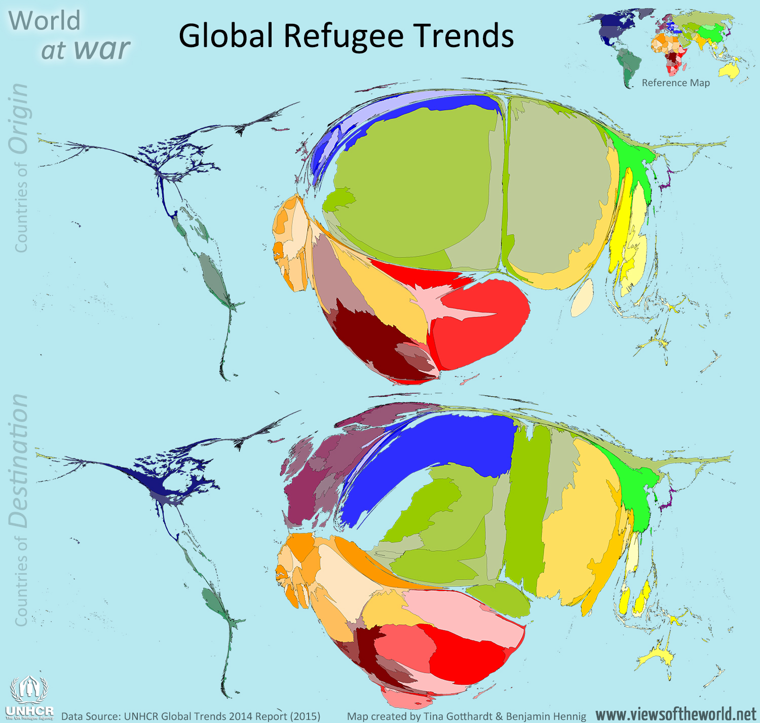
World at war: Global refugee trends
 The UNHCR Global Trends 2014 Report released earlier this week by the UN High Commissioner for Refugees finds that “wars, conflict and persecution have forced more people than at any other time since records began to flee their homes and seek refuge and safety elsewhere“.
Commemorating World Refugee Day, UN High Commissioner for Refugees António Guterres declared in a statement that “around the world, almost 60 million have been displaced by conflict and persecution. Nearly 20 million of them are refugees, and more than half are children. Their numbers are growing and accelerating, every single day, on every continent.” But while the ‘western’ media takes an often embarrassingly western-centric view, and European politicians struggling to find solutions to this global crisis, the report also shows how big this human crisis really has become.
The following two cartograms show the most recent picture of global refugee trends in 2014 as published in the 2015 UNHCR report. The two maps use the total numbers for ‘refugees and people in refugee-like situations’ according to their country of origin and destination and resizes each country according to its absolute number of refugees. Excluded in these maps are those refugees whose origin is unknown or who are stateless or cannot be assigned to a specific country:
Horsetrading: Equine Europe
There is a lot horsetrading going on in Europe. Literally. At the request of the European Commission the World Horse Welfare and Eurogroup for Animals have just published a report titled Removing the Blinkers which looks at the health and welfare of European Equidae in 2015. The report is the first comprehensive documentation of where horses are being kept in Europe, how they are kept, and how they are traded. The following cartogram shows a Europemapper-style cartogram depicting the EU population figures for equidea as stated in the report, using their mean figure (averaging the lowest and highest estimates for the number of horses in each country) which counts a total of just over 7 million horses in the European Union (compared to FAOSTAT estimates of only 4.3 million horses kept as livestock):

Global Gender Gap in Secondary Education
100% Equality was the theme of a session at this year’s Nexus Europe Youth Summit in London last week. As a member of the panel I started off by giving a global overview of the state of gender (in)equality and how this is being measured by different institutions, such as the United Nations Development Programme, the World Economic Forum, or the European Institute for Gender Equality. While they draw very different pictures in their detailed indicators, there are also a lot of similarities, with the European Nordic countries almost always being in the top spots of the overall index, which does not mean that in any of these countries absolute gender equality has been achieved. Globally seen, health equality is furthest progressed, why empowerment and participation remain amongst the most pressing issues.
The following map is from my slides that I have shown and displays the gender gap in secondary education around the world projected on an equal-population projection using a gridded cartogram transformation:
